Creating Publication Quality Charts with GEE (Full Course)
A comprehesive guide on creating high-quality data visualizations with Google Earth Engine and Google Charts.
Ujaval Gandhi
- Introduction
- Setting up the Environment
- Module 1. Time-Series Charts
- Module 2. Image Charts
- Module 3. FeatureCollection Charts
- 4. Advanced Charts
- Exporting Charts
- Supplement
- Dual Y-Axis Chart
- Night Time Lights (NTL) Trends
- Population Time Series
- Daily Time Series Chart
- Surface Water Area Time Series
- Histogram with Reducer
- Histogram of Multiple Bands
- Precipitation Combo Chart
- Transect Chart
- Logo Chart
- Stacked Bar Chart (DataTable)
- Colored Bar Chart (DataTable)
- Box Plot with Outliers (DataTable)
- Spectral Profile Charts (DataTable)
- References
- Data Credits
- License
- Citing and Referencing
![]()
Introduction
This is an intermediate-level class that is suited for participants who are familiar with the Google Earth Engine API and want to learn advanced data visualization methods. This class also introduces novel earth observation and climate datasets along with techniques to work with them.
Setting up the Environment
Sign-up for Google Earth Engine
If you already have a Google Earth Engine account, you can skip this step.
Visit our GEE Sign-Up Guide for step-by-step instructions.
Get the Course Materials
The course material and exercises are in the form of Earth Engine scripts shared via a code repository.
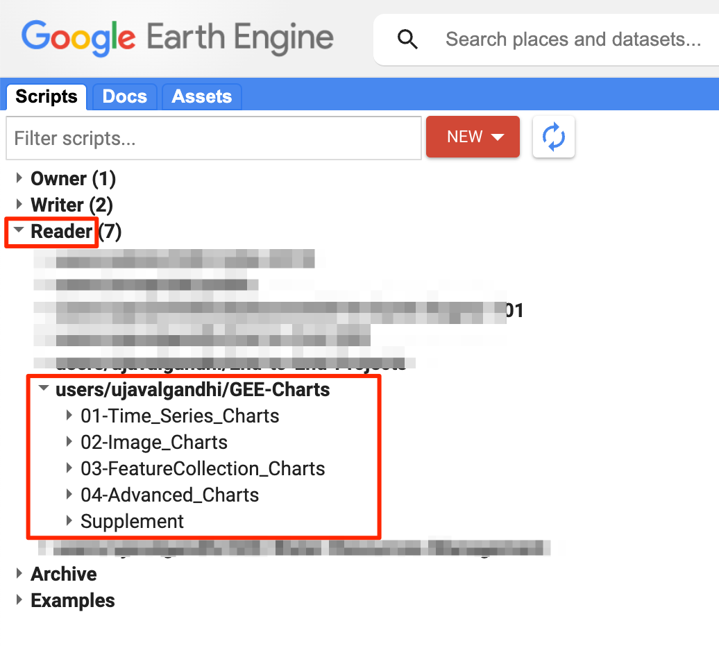
- Click this link to open Google Earth Engine code editor and add the repository to your account.
- If successful, you will have a new repository named
users/ujavalgandhi/GEE-Chartsin the Scripts tab in the Reader section. - Verify that your code editor looks like below
Code Editor with Course Repository
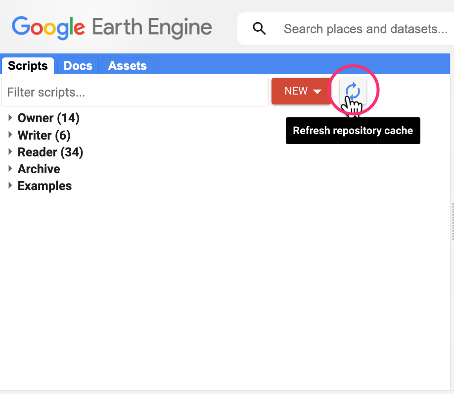
If you do not see the repository in the Reader section, click Refresh repository cache button in your Scripts tab and it will show up.
Refresh repository cache
Get the Course Videos
The course is accompanied by a set of videos covering the all the modules. These videos are recorded from our live instructor-led classes and are edited to make them easier to consume for self-study. We have 2 versions of the videos
YouTube
We have created a YouTube Playlist with separate videos for each script and exercise to enable effective online-learning. Access the YouTube Playlist ↗
Vimeo
We are also making combined full-length video for each module available on Vimeo. These videos can be downloaded for offline learning. Access the Vimeo Playlist ↗
Module 1. Time-Series Charts
In this section, we will explore various built-in functions to create time-series charts from ImageCollections. We will also explore the customization options provided by Google Charts to make high-quality functional graphics.
1.1 Simple Time-Series
We start by using the time-series charting function
ui.Chart.image.series() that allows you to create a
time-series plot from an ImageCollection at a single location. You get
one time-series per band of the input dataset. We take the TerraClimate
dataset and select the bands for monthly maximum and minimum
temperatures. The resulting chart is a Line
Chart that can be further customized using the
.setOptions() method.
Here are the customization applied to the default time-series chart:
lineWidth: Sets the thickness of the linepointSize: Sets the size of the data pointtitle: Sets the chart titlevAxis: Sets the options for Y-Axis. Axis label is specified using thetitleoption.hAxis: Sets the options for X-Axis. Grid lines are specified using thegridlinesoption. Date format for tick labels is specified withformatoption.series: Sets the options for each individual time-series. Series count starts from 0.
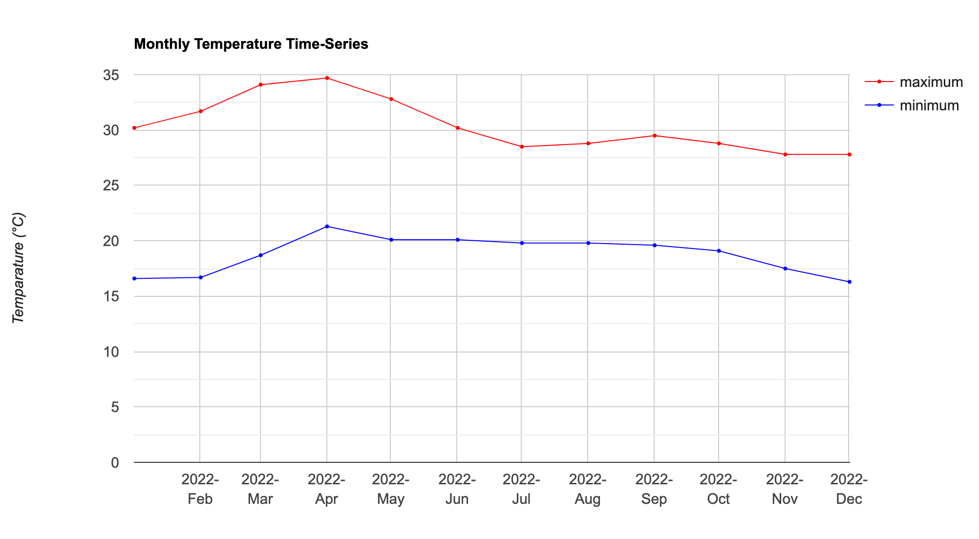
Time-Series Chart
// Select a location
var geometry = ee.Geometry.Point([77.57738128916243, 12.964758918835752]);

// We use TerraClimate Dataset
var terraclimate = ee.ImageCollection('IDAHO_EPSCOR/TERRACLIMATE');

// Select the temerature bands
// 'tmmx' = Maximum temperature
// 'tmmn' (Minimum temperature)
var temp = terraclimate.select(['tmmx', 'tmmn']);

// The pixel values have a scale factor of 0.1
// We must multiply the pixel values with the scale factor
// to get the temperature values in °C
var tempScaled = temp.map(function(image) {
  return image.multiply(0.1)
    .copyProperties(image,['system:time_start']);
});

// Filter the collection
var startYear = 2022;
var endYear = 2022;
var startDate = ee.Date.fromYMD(startYear, 1, 1);
var endDate = ee.Date.fromYMD(endYear + 1, 1, 1);

var filtered = tempScaled
  .filter(ee.Filter.date(startDate, endDate));

// Create a time-series chart
var chart = ui.Chart.image.series({
  imageCollection: filtered.select(['tmmx']),
  region: geometry,
  reducer: ee.Reducer.mean(),
  scale: 4638.3
});

// Print the chart
print(chart);

// We can use .setOptions() to customize the chart
var chart = ui.Chart.image.series({
  imageCollection: filtered.select(['tmmx']),
  region: geometry,
  reducer: ee.Reducer.mean(),
  scale: 4638.3
}).setOptions({
  lineWidth: 1,
  pointSize: 2,
  title: 'Monthly Temperature Time-Series',
  vAxis: {title: 'Temparature (°C)'},
  hAxis: {title: '', format: 'YYYY-MMM', gridlines: {count: 12}}
})
print(chart);

// We can select multiple bands and get a time-series for each band
// Additionally, we can specify the 'series' options
// to specify styling options for each series.
var chart = ui.Chart.image.series({
  imageCollection: filtered.select(['tmmx', 'tmmn'], ['maximum', 'minimum']),
  region: geometry,
  reducer: ee.Reducer.mean(),
  scale: 4638.3
}).setChartType('LineChart')
  .setOptions({
      lineWidth: 1,
      pointSize: 2,
      title: 'Monthly Temperature Time-Series',
      vAxis: {title: 'Temparature (°C)'},
      hAxis: {title: '', format: 'YYYY-MMM', gridlines: {count: 12}},
      series: {
        0: {color: 'red'},
        1: {color: 'blue'}
      },
    })

// Print the chart
print(chart);
Exercise
// Exercise

// a) Delete the 'geometry' and add a new point at your chosen location
// b) Modify the chart options display the series with dashed lines
// c) Print the chart.

// See reference:
// https://developers.google.com/chart/interactive/docs/lines#dashed
1.2 Time-Series with Trendlines
Google Charts can dynamically compute and display Trendlines on the chart. You can choose from linear, polynomial or exponential trendlines. The linear trendline fit a least-square regression model on the dataset. Here we take a time-series of precipitation data, aggregate it to yearly precipitation and then display a linear trendline to indicate whether we see an increasing or decreasing rainfall in the region.
Here are the styling options applied to the time-series chart:
vAxis.ticks: Sets the tick positions for Y-Axis. We manually specify the exact tick marks we want.gridlines.color: Sets the color of the grid lines.legend: Sets the position of the legend. Theinoptions makes the legend appear inside the chart.series.visibleInLegend: Sets whether a particular series label is visible in the legend.trendlines: Sets the option for trendlines. We override the default label usinglabelInLegendoption.
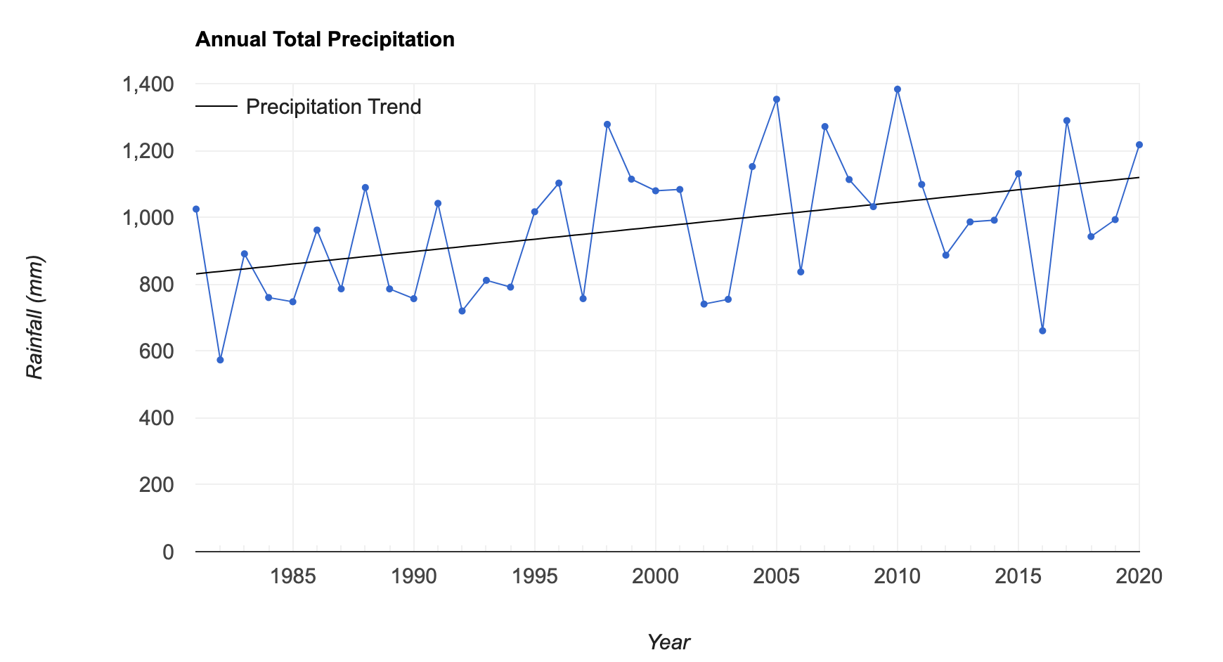
Time-Series Chart with Trendline
// Select a region
var geometry = ee.Geometry.Point([77.6045, 12.8992]);

// We use the CHIRPS Rainfall Dataset
var chirps = ee.ImageCollection('UCSB-CHG/CHIRPS/PENTAD');

// We will compute the trend of total annual precipitation
var createAnnualImage = function(year) {
  var startDate = ee.Date.fromYMD(year, 1, 1);
  var endDate = startDate.advance(1, 'year');
  var seasonFiltered = chirps
    .filter(ee.Filter.date(startDate, endDate));
  // Calculate total precipitation
  var total = seasonFiltered.reduce(ee.Reducer.sum()).rename('Precipitation');
  return total.set({
    'system:time_start': startDate.millis(),
    'system:time_end': endDate.millis(),
    'year': year,
  });
};

// Aggregate Precipitation Data over 40 years
var years = ee.List.sequence(1981, 2020);
var yearlyImages = years.map(createAnnualImage);
var yearlyCol = ee.ImageCollection.fromImages(yearlyImages);

// Create a time-series with a trendline
var chart = ui.Chart.image.series({
  imageCollection: yearlyCol,
  region: geometry,
  reducer: ee.Reducer.mean(),
  scale: 5566,
}).setOptions({
    title: 'Annual Total Precipitation',
    color: 'blue',
    pointSize: 3,
    lineWidth: 1,
    vAxis: {
      title: 'Rainfall (mm)',
      ticks: [0, 200, 400, 600, 800, 1000, 1200, 1400],
      gridlines: {color: '#f0f0f0'}
    },
    hAxis: {
      title: 'Year',
      gridlines: {color: '#f0f0f0'}
    },
    legend: {
      position: 'in'
    },
    series: {
      0: {
        visibleInLegend: false
      }
    },
    trendlines: {
      0: {
        type: 'linear',
        color: 'black',
        lineWidth: 1,
        pointSize: 0,
        visibleInLegend: true,
        labelInLegend: 'Precipitation Trend',
      }
    },
});
print(chart);
Exercise
// Exercise

// a) Delete the 'geometry' and add a new point at your chosen location
// b) Modify the chart options to remove the legend from the chart.
// c) Print the chart.

// Hint: Use legend 'position' option
// See reference:
// https://developers.google.com/chart/interactive/docs/gallery/linechart
1.3 Time-Series at Multiple Locations
So far, we have learnt how to display time-series of one or more
variables at a single location using the
ui.Chart.image.series() function. If you wanted to plot
time-series of multiple locations in a single chart, you can use the
ui.Chart.image.series.byRegion() function. This function
takes a FeatureCollection with one or more locations and extract the
time-series at each geometry.
Here we take the Global Forecast System (GFS) dataset and create a chart of 16-day temperature-forecasts at 2 cities.
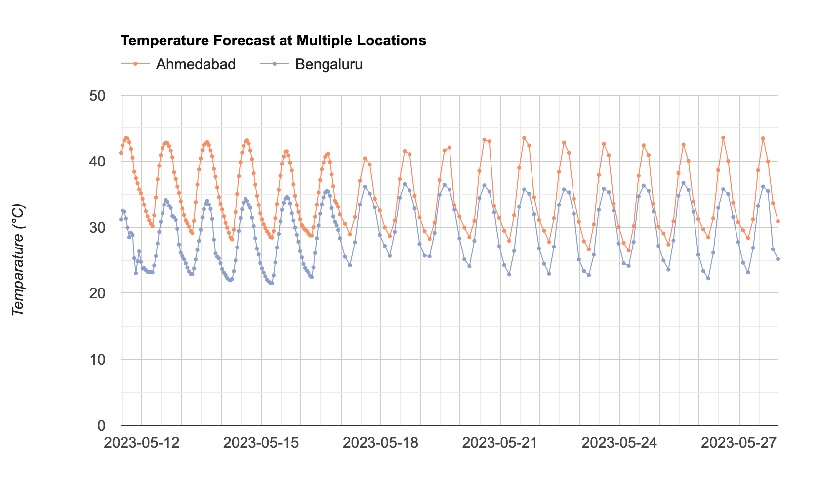
Time-Series Chart at Multiple Locations
// Select the locations
var geometry1 = ee.Geometry.Point([72.57, 23.04]);
var geometry2 = ee.Geometry.Point([77.58, 12.97]);

// We use the NOAA GFS dataset
var gfs = ee.ImageCollection('NOAA/GFS0P25');

// Select the temperature band
var forecast = gfs.select('temperature_2m_above_ground');

// Get the forecasts for today
// Forecasts are generated every 6 hours

// To account for ingestion delay, we get the forests
// generated in past 12 hours
// If you still get an error, increase the number of hours
var periodHours = 12;
var now = ee.Date(Date.now());
var before = now.advance(-periodHours, 'hour');

var filtered = forecast
  .filter(ee.Filter.date(before, now));

// All forecast images have a timestamp of the current day
// As we want a time-series of forecasts, we update the
// timestamp to the date the image is forecasting.
var filtered = filtered.select('temperature_2m_above_ground')
  .map(function(image) {
    var forecastTime = image.get('forecast_time');
    return image.set('system:time_start', forecastTime);
  });

// Create a chart of forecast at a single location
var chart = ui.Chart.image.series({
  imageCollection: filtered,
  region: geometry1,
  reducer: ee.Reducer.first(),
  scale: 27830}).setOptions({
    lineWidth: 1,
    pointSize: 2,
    title: 'Temperature Forecast at a Single Location',
    vAxis: {title: 'Temparature (°C)'},
    hAxis: {title: '', format: 'YYYY-MM-dd'},
    series: {
      0: {color: '#fc8d62'},
    },
    legend: {
      position: 'none'
    }
  });
print(chart);


// For plotting multiple locations, we need a FeatureCollection
var locations = ee.FeatureCollection([
  ee.Feature(geometry1, {'name': 'Ahmedabad'}),
  ee.Feature(geometry2, {'name': 'Bengaluru'})
  ]);

// Create a chart of forecasted temperatures

var chart = ui.Chart.image.seriesByRegion({
  imageCollection: filtered,
  regions: locations,
  reducer: ee.Reducer.first(),
  scale: 27830,
  seriesProperty: 'name'
}).setOptions({
      lineWidth: 1,
      pointSize: 2,
      title: 'Temperature Forecast at Multiple Locations',
      vAxis: {title: 'Temperature (°C)'},
      hAxis: {title: '', format: 'YYYY-MM-dd'},
      series: {
        0: {color: '#fc8d62'},
        1: {color: '#8da0cb'}
      },
      legend: {
        position: 'top'
      }
    });
print(chart);
Exercise
// Exercise
// a) Replace the 'geometry1' and 'geometry2' points with your chosen locations.
// b) Modify the chart options to limit the Y-Axis range to the
// actual range of temperatures at your chosen locations (i.e. between 20-45 degrees)
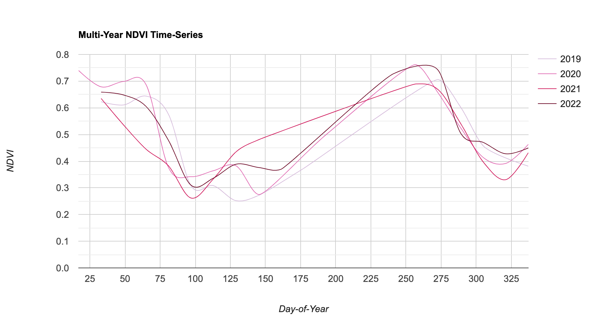
// c) Print the chart.1.4 Multi-Year Time-Series
Another useful function to plot time-series is
`ui.Chart.image.doySeriesByYear() that extracts and plots
values from an image band at different Day-Of-Year (DOY) over many
years. This type of chart is helpful visualize both inter-annual and
inter-annual variations in a single chart.
Here we take the MODIS 16-day Vegetation Indices (VI) dataset and create a chart of NDVI Time-Series over 4 years.
Here are the styling options applied to the time-series chart:
interpolateNulls: Sets whether to fill missing (i.e masked) time-series valuescurveType: Apply smoothing on the time-series by fitting a function.
DOY Time-Series Chart
// Select a location
var geometry = ee.Geometry.Point([81.73099978484261, 27.371459793533507]);

// We use the MODIS 16-day Vegetation Indicies dataset
var modis = ee.ImageCollection('MODIS/061/MOD13Q1');

// Filter the collection
var startYear = 2019;
var endYear = 2022;

var startDate = ee.Date.fromYMD(startYear, 1, 1);
var endDate = ee.Date.fromYMD(endYear + 1, 1, 1);

var filtered = modis
  .filter(ee.Filter.date(startDate, endDate))

// Pre-Processing: Cloud Masking and Scaling

// Function for Cloud Masking
var bitwiseExtract = function(input, fromBit, toBit) {
  var maskSize = ee.Number(1).add(toBit).subtract(fromBit)
  var mask = ee.Number(1).leftShift(maskSize).subtract(1)
  return input.rightShift(fromBit).bitwiseAnd(mask)
}

var maskSnowAndClouds = function(image) {
  var summaryQa = image.select('SummaryQA')
  // Select pixels which are less than or equals to 1 (0 or 1)
  var qaMask = bitwiseExtract(summaryQa, 0, 1).lte(1)
  var maskedImage = image.updateMask(qaMask)
  return maskedImage.copyProperties(
    image, ['system:index', 'system:time_start'])
}

// Function for Scaling Pixel Values
// MODIS NDVI values come as NDVI x 10000
// that need to be scaled by 0.0001
var ndviScaled = function(image) {
  var scaled = image.divide(10000)
  return scaled.copyProperties(
    image, ['system:index', 'system:time_start'])
};

// Apply the functions and select the 'NDVI' band
var processedCol = filtered
  .map(maskSnowAndClouds)
  .map(ndviScaled)
  .select('NDVI');

// Plot a time-series
var chart = ui.Chart.image.series({
  imageCollection: processedCol,
  region: geometry,
  reducer: ee.Reducer.mean(),
  scale: 250
}).setOptions({
    interpolateNulls: true,
    lineWidth: 1,
    pointSize: 2,
    title: 'NDVI Time-Series',
    vAxis: {title: 'NDVI'},
})
print(chart);

// We can plot a yearly time-series
// that allows us to compare changes over time
var chart = ui.Chart.image.doySeriesByYear({
  imageCollection: processedCol,
  region: geometry,
  regionReducer: ee.Reducer.mean(),
  scale: 250,
  bandName: 'NDVI'
}).setOptions({
      interpolateNulls: true,
      curveType: 'function',
      lineWidth: 1,
      pointSize: 2,
      title: 'Multi-Year NDVI Time-Series',
      vAxis: {title: 'NDVI'},
      hAxis: {title: 'Day-of-Year'},
      legend: {position: 'top'}
    })
print(chart)
Exercise
Exercise 04c
// Exercise

// a) Replace the 'geometry' with your chosen location.
// b) Modify the chart to specify custom colors for each year.
//    Use color codes from https://colorbrewer2.org/
// c) Modify the chart to plot only the time-series
//    with lines without any points.
// c) Print the chart.
Module 2. Image Charts
This section covers charting functions and techniques to plot values from an image. We will also learn how to deal with limitations of the charting API and create plots by extracting data from large regions.
2.1 Image Histogram
A histogram plot is a bar chart showing count of pixel values. Typically the pixel values are grouped into range of values called buckets on the X-Axis and the total count of pixels is shown on the Y-Axis.
Here we take the Harmonized Night Time Lights dataset that contains images from both DMSP and VIIRS sensors.
Below is the list of styling options applied to the histogram:
hAxis.ticks: Sets the tick labels on the X-Axis.bar.gap: Sets the gap between each histogram bar
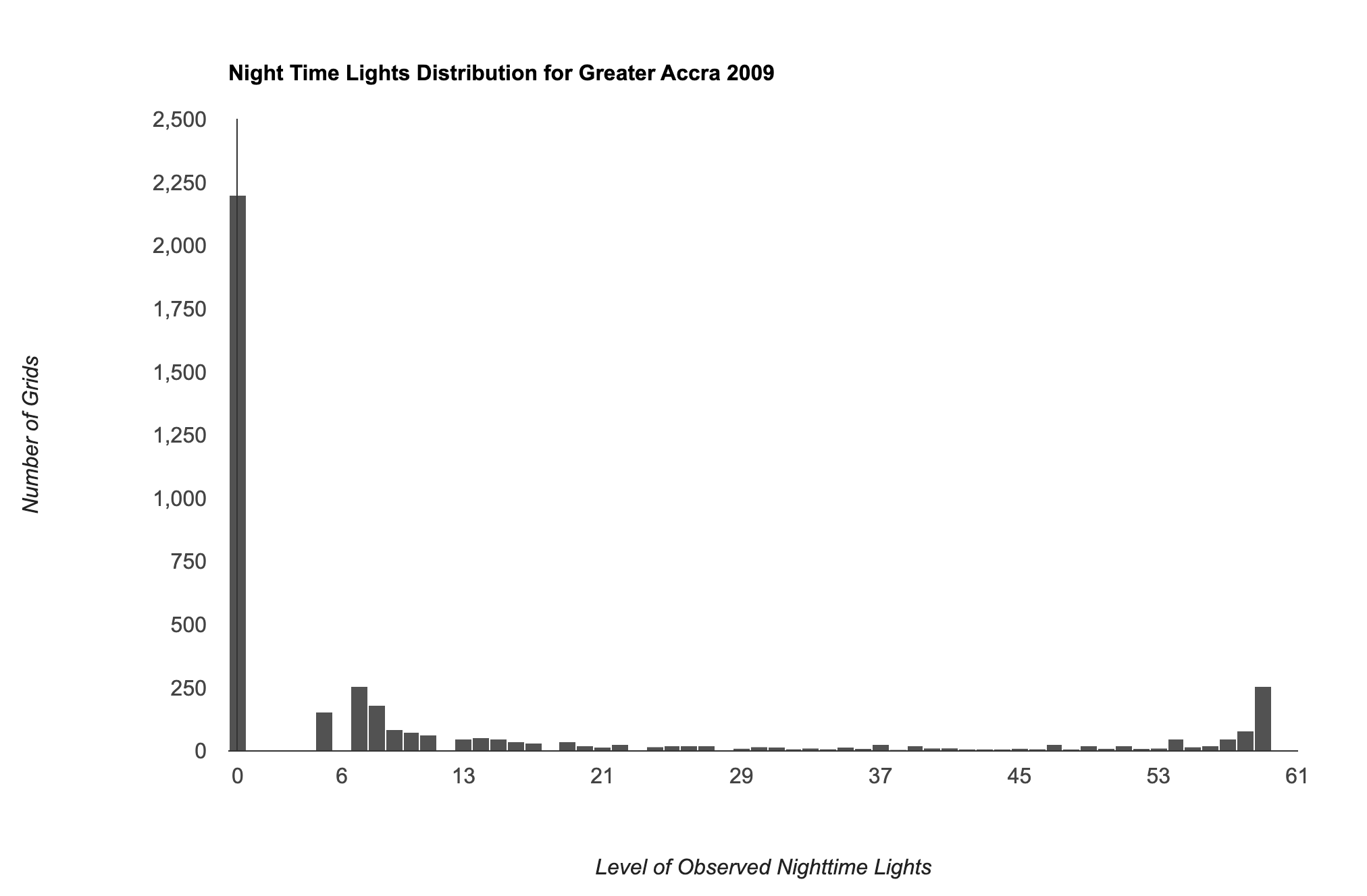
Image Histogram
// We use the Harmonized Global Night Time Lights (1992-2020) dataset
var dmsp = ee.ImageCollection('projects/sat-io/open-datasets/Harmonized_NTL/dmsp');
var viirs = ee.ImageCollection('projects/sat-io/open-datasets/Harmonized_NTL/viirs');

// Merge both collections to create a single Night Lights Collection
var ntlCol = dmsp.merge(viirs);

// Using GeoBoundries admin boundaries
var admin0 = ee.FeatureCollection("projects/sat-io/open-datasets/geoboundaries/CGAZ_ADM0");
var admin1 = ee.FeatureCollection("projects/sat-io/open-datasets/geoboundaries/CGAZ_ADM1");
var admin2 = ee.FeatureCollection("projects/sat-io/open-datasets/geoboundaries/CGAZ_ADM2");

// Select a Admin0 value
print(admin0.aggregate_array('shapeName'));
var admin0Name = 'Ghana';

// Now we have admin0 values, fetch admin1 values for that country

var selectedAdmin0 = admin0.filter(ee.Filter.eq('shapeName', admin0Name));
var shapeID = ee.Feature(selectedAdmin0.first()).get('shapeID');
var admin1Filtered = admin1.filter(ee.Filter.eq('ADM0_shape', shapeID));

// Select a Admin1 value
print(admin1Filtered.aggregate_array('shapeName'));
var admin1Name = 'Greater Accra';

var selected = admin1Filtered
        .filter(ee.Filter.eq('shapeName', admin1Name))

var geometry = selected.geometry();

var year = 2009;
var startDate = ee.Date.fromYMD(year, 1, 1);
var endDate = startDate.advance(1, 'year')

// We filter for the selected year
var filtered = ntlCol
  .filter(ee.Filter.date(startDate, endDate))

// Extract the image and set the masked pixels to 0
var ntlImage = ee.Image(filtered.first()).unmask(0);

var palette =['#253494','#2c7fb8','#41b6c4','#a1dab4','#ffffcc' ];
var ntlVis = {min:0, max: 63,  palette: palette}

Map.centerObject(geometry, 10);
Map.addLayer(ntlImage.clip(geometry), ntlVis, 'Night Time Lights ' + year);

// Extract the native resolution of the image
var resolution = ntlImage.projection().nominalScale();

// NTL images have DN values from 0-63
// We can create a histogram to show pixel counts
// for each DN value
var chart = ui.Chart.image.histogram({
  image: ntlImage,
  region: geometry,
  scale: resolution,
  maxBuckets: 63,
  minBucketWidth: 1})

print(chart);

// Add options to add labels and ticks
var chart = ui.Chart.image.histogram({
  image: ntlImage,
  region: geometry,
  scale: resolution,
  maxBuckets: 63,
  minBucketWidth: 1
}).setOptions({
    title: 'Night Time Lights Distribution for ' + admin1Name + ' ' + year,
    vAxis: {
      title: 'Number of Grids',
      gridlines: {color: 'transparent'},
    },
    hAxis: {
      title: 'Level of Observed Nighttime Lights',
      ticks: [0, 6, 13, 21, 29, 37, 45, 53, 61],
      gridlines: {color: 'transparent'}
    },
    bar: { gap: 1 },
    legend: { position: 'none' },
    colors: ['#525252']
  })

print(chart);
Exercise
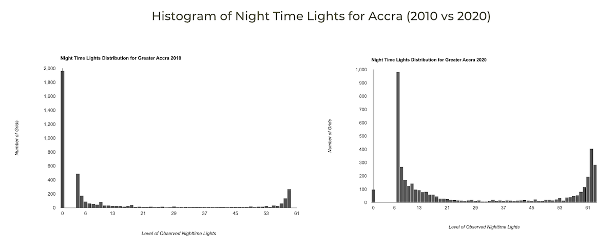
Exercise 01c
// Exercise
// The code now has a function createChart that creates a chart
// for the given year
// a) Change the name of the country to your chosen country
// b) Call the function to create histograms for the year 2010 and 2020
// c) Print the charts.
// Tip: Adjust the hAxis.viewWindow parameter to appropriate values
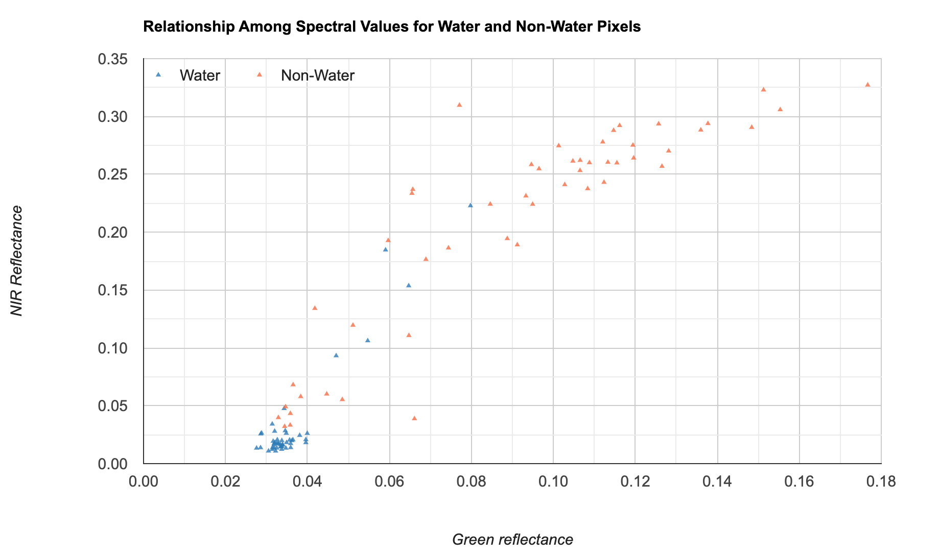
// for your chosen country2.2 Image Scatter Chart
A scatter plot is useful to explore the relationship between 2
variables. In Earth Engine, you can extract the pixel values from an
image using any of the sampling functions such as sample()
or stratifiedSample() to get a FeatureCollection with pixel
values for a random subset of the pixels. We can then plot the results
using the built-in charting functions for FeatureCollections.
Here we use the Sentinel-2 Surface Reflectance dataset along with
Global Surface Water Yearly Water History dataset to get reflectance
values of water and non-water pixels within the chosen region. We then
use the ui.Chart.feature.groups() function to plot the
results. Note that you can explicitly set the desired chart type using
the setChartType() function.
Below is the list of new styling options applied to the scatter plot:
titleTextStyle: Sets the style of the title text.dataOpacity: Sets the transparency for the data points. Useful when you have overlapping data points.pointShape: Sets the shape of the marker from the available marker shapes.
Scatter Plot
// We want to plot the relationship between
// 2 spectral bands for different classes

// Select a region
var geometry =   ee.Geometry.Polygon([[
  [76.816, 13.006],[76.816, 12.901],
  [76.899, 12.901],[76.899, 13.006]
]]);

// We use the Sentinel-2 SR data
var s2 = ee.ImageCollection('COPERNICUS/S2_SR_HARMONIZED');

// Add function for cloud masking
function maskS2clouds(image) {
  var qa = image.select('QA60');
  var cloudBitMask = 1 << 10;
  var cirrusBitMask = 1 << 11;
  var mask = qa.bitwiseAnd(cloudBitMask).eq(0).and(
             qa.bitwiseAnd(cirrusBitMask).eq(0));
  return image.updateMask(mask)
      .select('B.*')
      .multiply(0.0001)
      .copyProperties(image, ['system:time_start']);
}

// Filter and apply cloud mask
var filtered = s2
.filter(ee.Filter.lt('CLOUDY_PIXEL_PERCENTAGE', 30))
  .filter(ee.Filter.date('2020-01-01', '2021-01-01'))
  .filter(ee.Filter.bounds(geometry))
  .map(maskS2clouds)
  .select('B.*');

// Create a composite
var composite = filtered.median();

var rgbVis = {bands: ['B4', 'B3', 'B2'], min: 0, max: 0.3, gamma: 1.2};
Map.centerObject(geometry, 12);
Map.addLayer(composite.clip(geometry), rgbVis, 'RGB');

// Use the Global Surface Water Yearly dataset
var gswYearly = ee.ImageCollection('JRC/GSW1_4/YearlyHistory');

// Extract the image for the chosen year
var filtered = gswYearly.filter(ee.Filter.eq('year', 2020));
var gsw2020 = ee.Image(filtered.first());

// Select permanent or seasonal water
var water = gsw2020.eq(3).or(gsw2020.eq(2)).rename('water');
var waterVis = {min:0, max:1, palette: ['white','blue']};
Map.addLayer(water.clip(geometry).selfMask(), waterVis, 'Water', false);

// We want to splot the relationship between
// 'NIR' (B8) and 'GREEN' (B3) band reflectance
// for water and non-water pixels

// Select the bands
var bands = composite.select(['B8', 'B3']);

// Extract samples for both classes
var samples = bands.addBands(water).stratifiedSample({
  numPoints: 50,
  classBand: 'water',
  region: geometry,
  scale: 10})

print(samples.first());

// Create a chart and set the chart type
var chart = ui.Chart.feature.groups({
  features: samples,
  xProperty: 'B3',
  yProperty: 'B8',
  seriesProperty: 'water'
}).setChartType('ScatterChart');

print(chart);

// Customize the style
var chart = ui.Chart.feature.groups({
  features: samples,
  xProperty: 'B3',
  yProperty: 'B8',
  seriesProperty: 'water'
}).setChartType('ScatterChart')
  .setOptions({
    title: 'Relationship Among Spectral Values ' +
      'for Water and Non-Water Pixels',
    titleTextStyle: {bold: true},
    dataOpacity: 0.8,
    hAxis: {
      'title': 'Green reflectance',
      titleTextStyle: {italic: true},
    },
    vAxis: {
      'title': 'NIR Reflectance',
      titleTextStyle: {italic: true},

    },
    series: {
      0: {
        pointShape: 'triangle',
        pointSize: 4,
        color: '#2c7bb6',
        labelInLegend: 'Water',
        },
      1: {
        pointShape: 'triangle',
        pointSize: 4,
        color: '#f46d43',
        labelInLegend: 'Non-Water'
      }
    },
    legend: {position: 'in'}
    });
print(chart);
Exercise
// Exercise
// The code now contains a function createChart() that creates a scatter plot
// between the chosen bands

// a) Delete the 'geometry' and add a new polygon at your chosen location
// b) Create a chart for B3 and B11
// c) Print the chart.
2.3 Image Class Areas (Table)
Many analysts would want to create a chart or a table showing areas
of different landcover classes in an image. The EE API has a dedicated
function ui.Chart.Image.byClass() that can tabulate image
pixel values by class.
Here we use the ESA Landcover 2021 dataset and create a
Table chart of areas within the buffer zone of a
location. Note that we are using setChartType() function
with the option Table to create a table. Such tables
are useful when you are creating apps and want to display a formatted
table. The Global
Population Explorer is a good example where you can switch between a
Bar Chart and a Table to display the results.
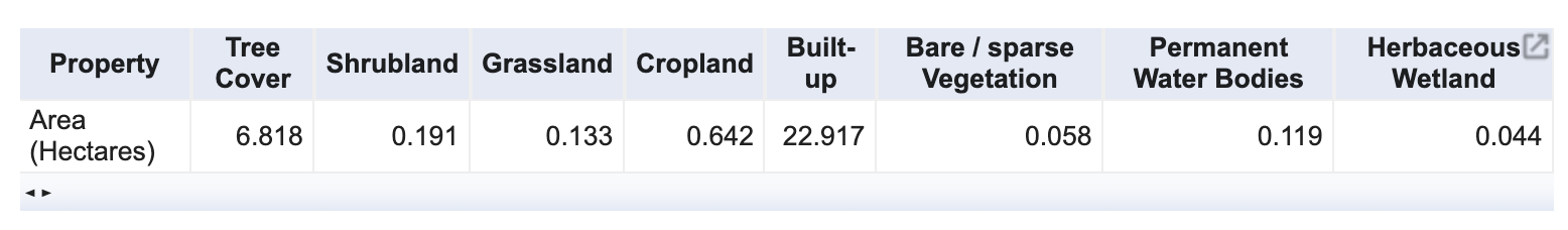
Table Chart
// Select a region
var geometry = ee.Geometry.Point([77.6045, 12.8992]);

// We use the ESA WorldCover 2021 dataset
var worldcover = ee.ImageCollection('ESA/WorldCover/v200').first();

// The image has 11 classes
// Remap the class values to have continuous values
// from 0 to 10
var classified = worldcover.remap(
  [10, 20, 30, 40, 50, 60, 70, 80, 90, 95, 100],
  [0,  1 , 2,  3,  4,  5,  6,  7,  8,  9,  10]).rename('classification');

// Define a list of class names
var worldCoverClassNames= [
  'Tree Cover', 'Shrubland', 'Grassland', 'Cropland', 'Built-up',
  'Bare / sparse Vegetation', 'Snow and Ice',
  'Permanent Water Bodies', 'Herbaceous Wetland',
  'Mangroves', 'Moss and Lichen'];
// Define a list of class colors
var worldCoverPalette = [
  '006400', 'ffbb22', 'ffff4c', 'f096ff', 'fa0000',
  'b4b4b4', 'f0f0f0', '0064c8', '0096a0', '00cf75',
  'fae6a0'];

var visParams = {min:0, max:10, palette: worldCoverPalette};
Map.addLayer(classified, visParams, 'Landcover');

// We want to compute the class areas in a buffer zone
var bufferDistance = 1000;
var buffer = geometry.buffer(bufferDistance);
Map.centerObject(buffer, 12);
Map.addLayer(buffer, {color: 'gray'}, 'Buffer Zone');

// Create an area image and convert to Hectares
var areaImage = ee.Image.pixelArea().divide(1e4);

// Add the band containing classes
var areaImageWithClass = areaImage.addBands(classified);

// Create a chart
var chart = ui.Chart.image.byClass({
  image: areaImageWithClass,
  classBand: 'classification',
  region: buffer,
  reducer: ee.Reducer.sum(),
  scale: 10,
});
print(chart);

// Set the chart type and add styling options
var chart = ui.Chart.image.byClass({
  image: areaImageWithClass,
  classBand: 'classification',
  region: buffer,
  reducer: ee.Reducer.sum(),
  scale: 10,
  classLabels: worldCoverClassNames,
  xLabels: ['Area (Hectares)']
}).setChartType('Table');

print(chart);
Exercise
// Exercise

// a) Delete the 'geometry' and add a new point at your chosen location
// b) Change the buffer distance to 10km and Area units to Square Kilometers
// c) Print the chart.
Module 3. FeatureCollection Charts

3.1 Image Class Areas (Pie Chart)
One of the biggest limitations of the GEE Charting API is that it cannot create charts from more than 10000000 pixels. While this may seem like a big number, you can easily run into this limit when working with images that cover large areas. If you try creating charts for large regions, you may run into an error such as below:
Image.reduceRegion: Too many pixels in the region. Found 159578190, but maxPixels allows only 10000000. Ensure that you are not aggregating at a higher resolution than you intended; that is a frequent cause of this error. If not, then you may set the ‘maxPixels’ argument to a limit suitable for your computation; set ‘bestEffort’ to true to aggregate at whatever scale results in ‘maxPixels’ total pixels; or both.
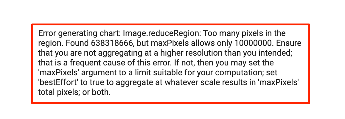
Chart Error
Fortunately, there is a way around it. Earth Engine allows you to
aggregate values from very large regions using reducers that have an
option to specify a maxPixels parameter. You will need to
use the appropriate reducer and create a FeatureCollection with the
results. The resulting value can then be plotted easily using the
charting functions.
Here we take the same dataset as the previous section, but try to summarize the area by class over a much larger region. We use a Grouped Reducer to compute the class areas and post-process the result into a FeatureCollection. If you find the code hard to understand, please review our article on Calculating Area in Google Earth Engine for explanation.
We set the chart type to PieChart and plot the
percentage of area of each class in the region.
Below is the list of new styling options applied to the pie chart:
pieSliceBorderColor: Sets the edge color of each pie slice.pieSliceTextStyle: Sets the text style of pie slice labels.pieSliceText: Sets the format of the text.sliceVisibilityThreshold: Sets the threshold below which to group small slices into others category.
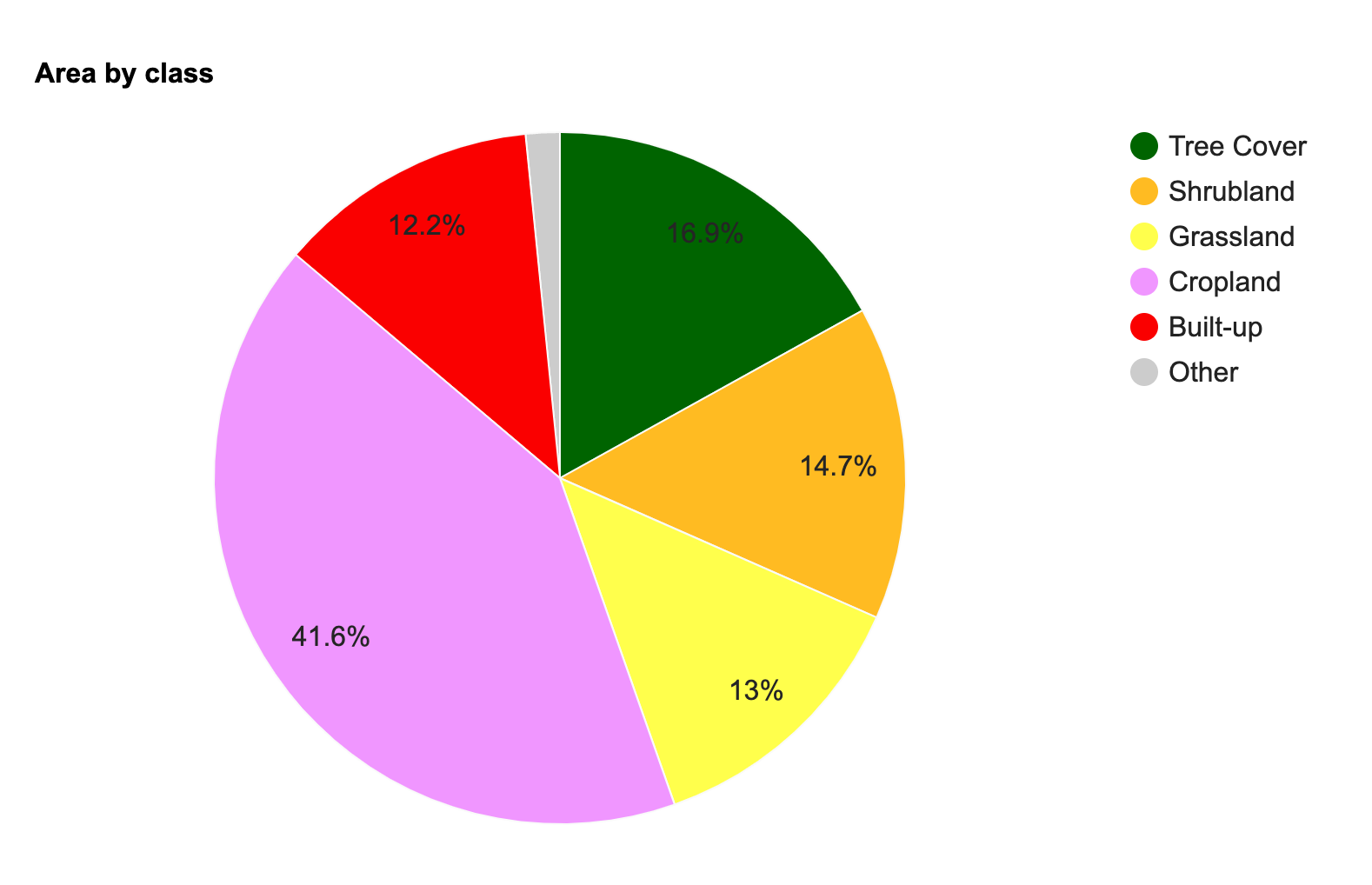
Pie Chart
// Select a region
var geometry = ee.Geometry.Point([77.6045, 12.8992]);

// We use the ESA WorldCover 2021 dataset
var worldcover = ee.ImageCollection('ESA/WorldCover/v200').first();

// The image has 11 classes
// Remap the class values to have continuous values
// from 0 to 10
var classified = worldcover.remap(
  [10, 20, 30, 40, 50, 60, 70, 80, 90, 95, 100],
  [0,  1 , 2,  3,  4,  5,  6,  7,  8,  9,  10]).rename('classification');

// Define a list of class names
var worldCoverClassNames= [
  'Tree Cover', 'Shrubland', 'Grassland', 'Cropland', 'Built-up',
  'Bare / sparse Vegetation', 'Snow and Ice',
  'Permanent Water Bodies', 'Herbaceous Wetland',
  'Mangroves', 'Moss and Lichen'];
// Define a list of class colors
var worldCoverPalette = [
  '006400', 'ffbb22', 'ffff4c', 'f096ff', 'fa0000',
  'b4b4b4', 'f0f0f0', '0064c8', '0096a0', '00cf75',
  'fae6a0'];
// We define a dictionary with class names
var classNames = ee.Dictionary.fromLists(
  ['0','1','2','3','4','5','6','7','8','9', '10'],
  worldCoverClassNames
);
// We define a dictionary with class colors
var classColors = ee.Dictionary.fromLists(
  ['0','1','2','3','4','5','6','7','8','9', '10'],
  worldCoverPalette
);
var visParams = {min:0, max:10, palette: worldCoverPalette};
Map.addLayer(classified, visParams, 'Landcover');

// We want to compute the class areas in a buffer zone
var bufferDistance = 50000;
var buffer = geometry.buffer(bufferDistance);
Map.centerObject(buffer, 12);
Map.addLayer(buffer, {color: 'gray'}, 'Buffer Zone');

// Create an area image and convert to Hectares
var areaImage = ee.Image.pixelArea().divide(1e4);

// Add the band containing classes
var areaImageWithClass = areaImage.addBands(classified);

// As charting functions do not work on more than
// 10000000 pixels, we need to extract the areas using
// a reducer and create a FeatureCollection first

// Use a Grouped Reducer to calculate areas
var areas = areaImageWithClass.reduceRegion({
      reducer: ee.Reducer.sum().group({
      groupField: 1,
      groupName: 'classification',
    }),
    geometry: buffer,
    scale: 10,
    maxPixels: 1e10
    });

var classAreas = ee.List(areas.get('groups'));

// Process results to extract the areas and
// create a FeatureCollection
var classAreaList = classAreas.map(function(item) {
  var areaDict = ee.Dictionary(item);
  var classNumber = areaDict.getNumber('classification').format();
  var classArea = areaDict.getNumber('sum');
  var className = classNames.get(classNumber);
  var classColor = classColors.get(classNumber);
  // Create a feature with geometry and
  // required data as a dictionary
  return ee.Feature(geometry, {
    'class': classNumber,
    'class_name': className,
    'Area': classArea,
    'color': classColor
  });
});

var classAreaFc = ee.FeatureCollection(classAreaList);

print('Class Area (FeatureCollection)', classAreaFc);

// We can now chart the resulting FeatureCollection
// If your area is large, it is advisable to first Export
// the featurecolleciton as an Asset and import it once
// the export is finished.
var chart = ui.Chart.feature.byFeature({
  features: classAreaFc,
  xProperty: 'class_name',
  yProperties: ['Area']
}).setChartType('PieChart')
.setOptions({
  title: 'Area by class',
});

print(chart);

// The pie colors do not match the class colors
// We need to create a list of colors for
// all the classes present in the FeatureCollection
var colors = classAreaFc.aggregate_array('color');
print(colors);

// The variable 'colors' is a server-side object
// Use evaluate() to convert it to client-side
// and use the results in the chart
colors.evaluate(function(colorlist) {
  // Let's create a Pie Chart
  var areaChart = ui.Chart.feature.byFeature({
    features: classAreaFc,
    xProperty: 'class_name',
    yProperties: ['Area']
  }).setChartType('PieChart')
    .setOptions({
      title: 'Area by class',
      colors: colorlist,
      pieSliceBorderColor: '#fafafa',
      pieSliceTextStyle: {'color': '#252525'},
      pieSliceText: 'percentage',
      sliceVisibilityThreshold: 0.10
  });
  print(areaChart);
});
Exercise
/ Exercise

// a) Delete the 'geometry' and add a new point at your chosen location
// b) Modify the chart options to show one of the slices separated from the pie.
// c) Print the chart.

// Hint: Use the 'offset' property
// https://developers.google.com/chart/interactive/docs/gallery/piechart#exploding-a-slice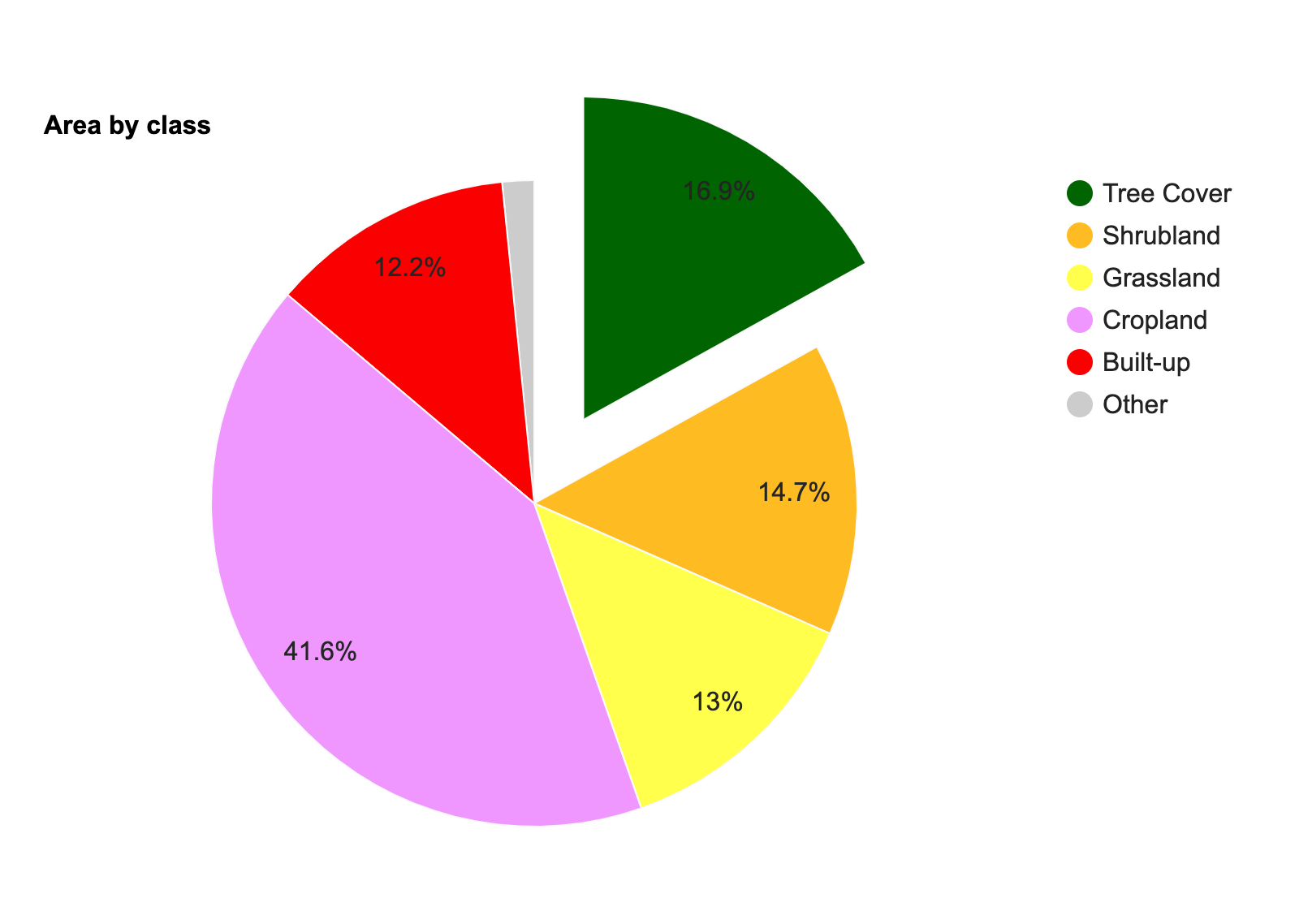
Exercise 04c
3.2 FeatureCollection Column Chart
In the previous example, we used the
ui.Chart.feature.byFeature() function to create a plot from
the properties of each feature. There are fewer built-in functions to
create different plots from FeatureCollections, but we can always use
the GEE API to process our data and create a FeatureCollection to meet
our requirements.
Here we take the WRI Global Power Plant Database and create a plot
showing total installed capacity by fuel type for the chosen country.
The FeatureCollection has one feature for each power plant, so we first
need to process the collection to create one feature for each fuel type
having a property with the total capacity. We use the a Grouped
Reducer with the reduceColumns() function to calculate
group statistics on a FeatureCollection.
We then use the ui.Chart.feature.byFeature() function to
create a Bar Chart.
Google Charts uses the term Column Chart for a vertical bar chart, while the term Bar Chart is used for a horizonal bar chart.
Below is the list of new styling options applied to the column chart:
backgroundColor: Sets the background color for the whole chart.
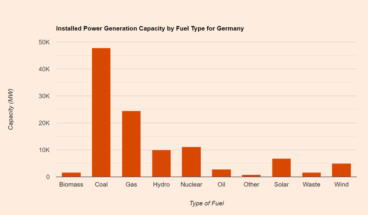
Column Chart
// Use the WRI Global Power Plant Database
var table = ee.FeatureCollection('projects/sat-io/open-datasets/global_power_plant_DB_1-3');

// Select features for a country
var country = 'Germany';
var filtered = table
  .filter(ee.Filter.eq('country_long', country));
print(filtered.first());

// We want to calculate total installed capacity
// by each fuel type
// We use a Grouped Reducer to sum 'capacity_mw'
// values grouped by 'primary_fuel'
var stats = filtered.reduceColumns({
  selectors: ['capacity_mw', 'primary_fuel'],
  reducer: ee.Reducer.sum().setOutputs(['capacity_mw']).group({
      groupField: 1,
      groupName: 'primary_fuel',
    })
});

// Post-process the result into a FeatureCollection
var groupStats = ee.List(stats.get('groups'));
var groupFc = ee.FeatureCollection(groupStats.map(function(item) {
  return ee.Feature(null, item);
}));

// Create a chart
var chart = ui.Chart.feature.byFeature({
  features: groupFc,
  xProperty: 'primary_fuel',
  yProperties: ['capacity_mw']
}).setChartType('ColumnChart')
  .setOptions({
    title: 'Installed Power Generation Capacity by Fuel Type for ' + country,
    vAxis: {
      title: 'Capacity (MW)',
      format: 'short'
    },
    hAxis: {
      title: 'Type of Fuel'},
    backgroundColor: '#feedde',
    colors: ['#d94801'],
    legend: { position: 'none' },
  });
print(chart);
Exercise
// a) Change the country name to your chosen country
// b) Sort the groupFc by 'capacity_mw' property so the bars are plotted
//    from largest to smallest values
// c) Print the chart

// Hint: Use the .sort() function
Exercise 02c
4. Advanced Charts
4.1 DataTable Charts
The charting helper functions provided by the GEE Javascript API
offer a simpler way to create many types of commonly used charts. But in
doing so, it offers a subset of the functionality provided by Google
Charts API. Whenever you find yourself limited by the built-in charting
functions and want additional customization, you can use the
ui.Chart() function which allows you to specify a Google
Charts DataTable
for creating your chart. There are many options to create a DataTable
object but I would recommend using the Javascript
Literal Initializer which is more explicit and readable compared to
other methods. You create a table object with a cols key
containing column specifications and a rows key with the
data values.
Here we take a sample dataset from the survey of Users of open Big Earth data – An analysis of the current state by Wagemann, J. et. al and reproduce a chart showing Use of Programming Languages for using the GEE Charts API.
Below is the list of new styling options applied to the pie chart:
annotations.alwaysOutside: Renders the annotations outside of the bars.annotations.textStyle: Sets the text style of the annotations.annotations.boxStyle: Sets the style of the box around annotation text.
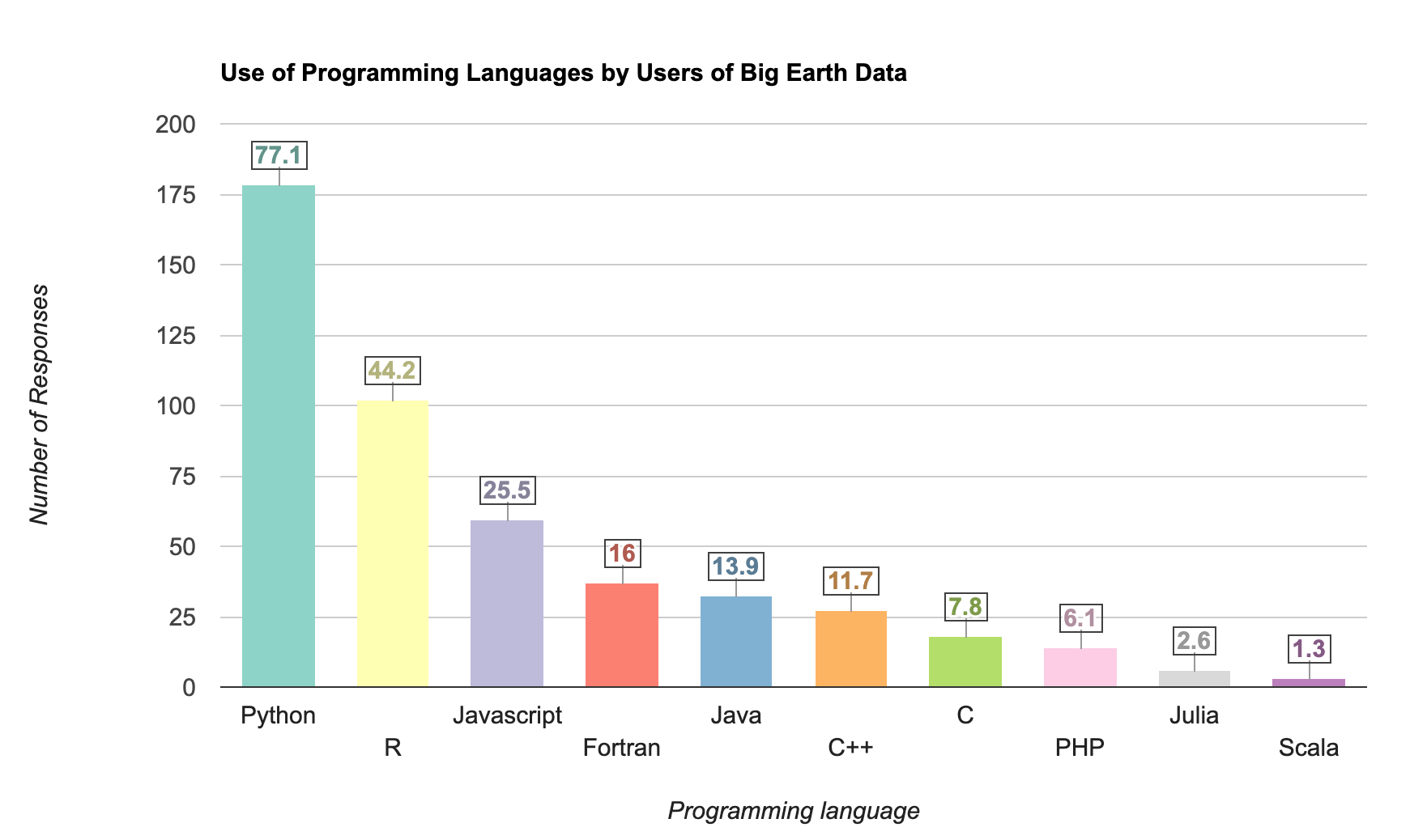
DataTable Column Chart
// We use the Big Earth Data - Survey 2019 data
// https://zenodo.org/record/4075058

// Create a DataTable
var dataTable = {
  cols: [
    {id: 'language', label: 'Programming Language', type: 'string'},
    {id: 'responses', label: 'Number of Responses', type: 'number'},
    {id: 'percentage', label: 'Percentage', type: 'number', role: 'annotation'},
    {id: 'style', label: 'Style', type: 'string', role: 'style'},

  ],
  rows: [
    {c: [ {v: 'Python'}, {v: 178}, {v: 77.1}, {v: 'color: #8dd3c7'}]},
    {c: [ {v: 'R'}, {v: 102}, {v: 44.2}, {v: 'color: #ffffb3'} ]},
    {c: [ {v: 'Javascript'}, {v: 59}, {v: 25.5}, {v: 'color: #bebada'} ]},
    {c: [ {v: 'Fortran'}, {v: 37}, {v: 16}, {v: 'color: #fb8072'} ]},
    {c: [ {v: 'Java'}, {v: 32}, {v: 13.9}, {v: 'color: #80b1d3'}]},
    {c: [ {v: 'C++'}, {v: 27}, {v: 11.7}, {v: 'color: #fdb462'}]},
    {c: [ {v: 'C'}, {v: 18}, {v: 7.8}, {v: 'color: #b3de69'}]},
    {c: [ {v: 'PHP'}, {v: 14}, {v: 6.1}, {v: 'color: #fccde5'} ]},
    {c: [ {v: 'Julia'}, {v: 6}, {v: 2.6}, {v: 'color: #d9d9d9'} ]},
    {c: [ {v: 'Scala'}, {v: 3}, {v: 1.3}, {v: 'color: #bc80bd'}]},
    ]
};

// Create a dictionary for options
var options = {
    title: 'Use of Programming Languages by Users of Big Earth Data',
    vAxis: {
      title: 'Number of Responses',
      viewWindow: {min:0, max: 200}
    },
    hAxis: {title: 'Programming language'},
    legend: {position: 'none'},
    annotations: {
      alwaysOutside: true,
      textStyle: {bold: true},
      boxStyle: {
      stroke: '#404040',
      strokeWidth: 1,
      }
    }
  }

// Use ui.Chart() to create a chart
var chart = ui.Chart(dataTable, 'ColumnChart', options);
// Print the chart
print(chart);
Exercise
// Exercise

// The DataTable now has an additional value with the 'f' key showing the formatted value

// a) Change the chart to show horizonal bars. Hint: Use the type 'BarChart'
// b) Fix the X and Y-axis labels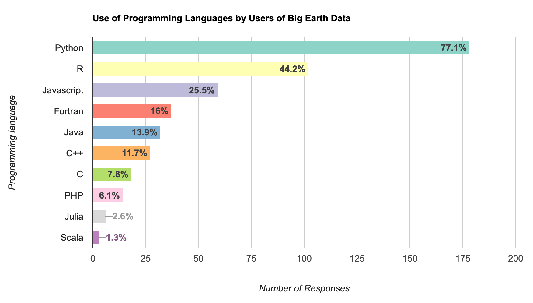
Exercise 01c
4.2 Box Plots
Many scientific analysis require showing the spread of values at each
data point using a Box Plot or a Whisker Plot. Google
Charts supports this using Intervals.
To display the intervals, we must define a DataTable where certain
columns are assigned the role of an
interval.
We start with a Sentinel-2 NDVI Time-Series at a farm polygon showing the median values within the polygon at each observation. We process the results using Combined Reducers and calculate the minimum, first quartile, second quartile, third quartile and maximum values. Since these values will be used in a DataTable, we apply additional formatting to create a dictionary for each row as per the Javascript literal format.
Below is the list of new styling options applied to the interval chart:
intervals: Sets style of the interval values.interval: Override the style of selected intervals.
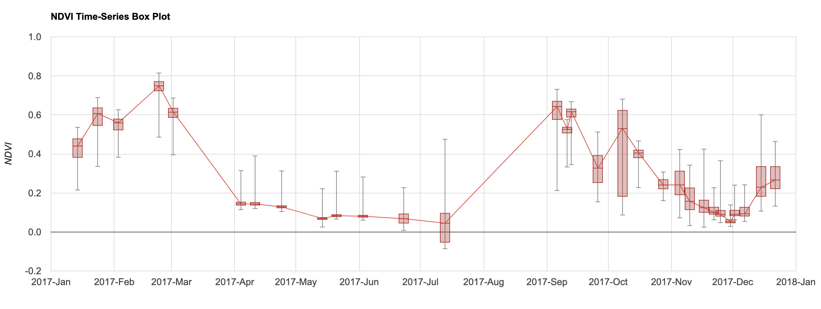
Box Plot
var s2 = ee.ImageCollection('COPERNICUS/S2_HARMONIZED');
var geometry = ee.Geometry.Polygon([[
  [82.60642647743225, 27.16350437805251],
  [82.60984897613525, 27.1618529901377],
  [82.61088967323303, 27.163695288375266],
  [82.60757446289062, 27.16517483230927]
]]);

Map.addLayer(geometry, {color: 'red'}, 'Farm');
Map.centerObject(geometry);
var rgbVis = {min: 0.0, max: 3000, bands: ['B4', 'B3', 'B2']};

var filtered = s2
  .filter(ee.Filter.date('2017-01-01', '2018-01-01'))
  .filter(ee.Filter.lt('CLOUDY_PIXEL_PERCENTAGE', 30))
  .filter(ee.Filter.bounds(geometry));

// Write a function for Cloud masking
function maskS2clouds(image) {
  var qa = image.select('QA60');
  var cloudBitMask = 1 << 10;
  var cirrusBitMask = 1 << 11;
  var mask = qa.bitwiseAnd(cloudBitMask).eq(0).and(
             qa.bitwiseAnd(cirrusBitMask).eq(0));
  return image.updateMask(mask).multiply(0.0001)
      .select('B.*')
      .copyProperties(image, ['system:time_start']);
}

var filtered = filtered.map(maskS2clouds);
// Write a function that computes NDVI for an image and adds it as a band
function addNDVI(image) {
  var ndvi = image.normalizedDifference(['B8', 'B4']).rename('ndvi');
  return image.addBands(ndvi);
}

// Map the function over the collection
var withNdvi = filtered.map(addNDVI);

// Plot the median NDVI values over time
// Display a time-series chart
var chart = ui.Chart.image.series({
  imageCollection: withNdvi.select('ndvi'),
  region: geometry,
  reducer: ee.Reducer.median(),
  scale: 10
}).setOptions({
      lineWidth: 1,
      title: 'NDVI Time Series',
      interpolateNulls: true,
      vAxis: {title: 'NDVI'},
      hAxis: {title: '', format: 'YYYY-MMM'}
    })
print(chart);

// Extract the values from each image
var values = withNdvi.map(function(image) {
  var ndvi = image.select('ndvi');

  var allReducers = ee.Reducer.median()
    .combine({reducer2: ee.Reducer.min(), sharedInputs: true} )
    .combine({reducer2: ee.Reducer.max(), sharedInputs: true} )
    .combine({reducer2: ee.Reducer.percentile([25]), sharedInputs: true} )
    .combine({reducer2: ee.Reducer.percentile([50]), sharedInputs: true} )
    .combine({reducer2: ee.Reducer.percentile([75]), sharedInputs: true} )

  var stats = ndvi.reduceRegion({
    reducer: allReducers,
    geometry: geometry,
    scale: 10});
  var date = image.date();
  var dateString = date.format('YYYY-MM-dd');

  var properties = {
    'date': dateString,
    'median': stats.get('ndvi_p50'), // median is 50th percentile
    'min': stats.get('ndvi_min'),
    'max': stats.get('ndvi_max'),
    'p25': stats.get('ndvi_p25'),
    'p50': stats.get('ndvi_p50'),
    'p75': stats.get('ndvi_p75'),
  }
  return ee.Feature(null, properties)

});

// Remove null values
var values = values.filter(ee.Filter.notNull(
  ['median', 'min', 'max', 'p25', 'p50', 'p75']));

// Format the results as a list of DataTable rows

// We need a list to map() over
var dateList = values.aggregate_array('date');

// Helper function to format dates as per DataTable requirements
// Converts date strings
// '2017-01-01' becomes 'Date(2017,0,1)'
// month is indexed from 0 in Date String representation
function formatDate(date) {
  var year = ee.Date(date).get('year').format();
  var month = ee.Date(date).get('month').subtract(1).format();
  var day = ee.Date(date).get('day').format();
  return ee.String('Date(')
    .cat(year)
    .cat(', ')
    .cat(month)
    .cat(', ')
    .cat(day)
    .cat(ee.String(')'));
}

var rowList = dateList.map(function(date) {
  var f = values.filter(ee.Filter.eq('date', date)).first();
  var x = formatDate(date);
  var median = f.get('median');
  var min = f.get('min');
  var max = f.get('max');
  var p25 = f.get('p25');
  var p50 = f.get('p50');
  var p75 = f.get('p75');
  var rowDict = {
    c: [{v: x}, {v: median}, {v: min}, {v: max},
        {v: p25}, {v: p50}, {v: p75}]
  };
  return rowDict;
});

print('Rows', rowList);

// We need to convert the server-side rowList object
// to client-side javascript object
// use evaluate()
rowList.evaluate(function(rowListClient) {
  var dataTable = {
    cols: [
      {id: 'x', type: 'date'},
      {id: 'median', type: 'number'},
      {id: 'min', type: 'number', role: 'interval'},
      {id: 'max', type: 'number', role: 'interval'},
      {id: 'firstQuartile', type: 'number', role: 'interval'},
      {id: 'median', type: 'number', role: 'interval'},
      {id: 'thirdQuartile', type:'number', role: 'interval'}
    ],
    rows: rowListClient
  };

  var options = {
    title:'NDVI Time-Series Box Plot',
    vAxis: {
      title: 'NDVI',
      gridlines: {
        color: '#d9d9d9'
      },
      minorGridlines: {
        color: 'transparent'
      }
    },
    hAxis: {
      title: '',
      format: 'YYYY-MMM',
      viewWindow: {
        min: new Date(2017, 0),
        max: new Date(2018, 0)
      },
      gridlines: {
        color: '#d9d9d9'
      },
      minorGridlines: {
        color: 'transparent'
      }
    },
    legend: {position: 'none'},
    lineWidth: 1,
    series: [{'color': '#D3362D'}],
    interpolateNulls: true,
    intervals: {
      barWidth: 2,
      boxWidth: 4,
      lineWidth: 1,
      style: 'boxes'
    },
    interval: {
      min: {
        style: 'bars',
        fillOpacity: 1,
        color: '#777777'
      },
      max: {
        style: 'bars',
        fillOpacity: 1,
        color: '#777777'
      }
    },
    chartArea: {left:100, right:100}
  };

  var chart = ui.Chart(dataTable, 'LineChart', options);
  print(chart);
  });
Exercise
// Exercise

// a) Delete the 'geometry' and add a polygon at your chosen location.
// b) Modify the chart options hide the line connecting the bars.
// c) Print the chart.

// Hint: Set the lideWidth to 0.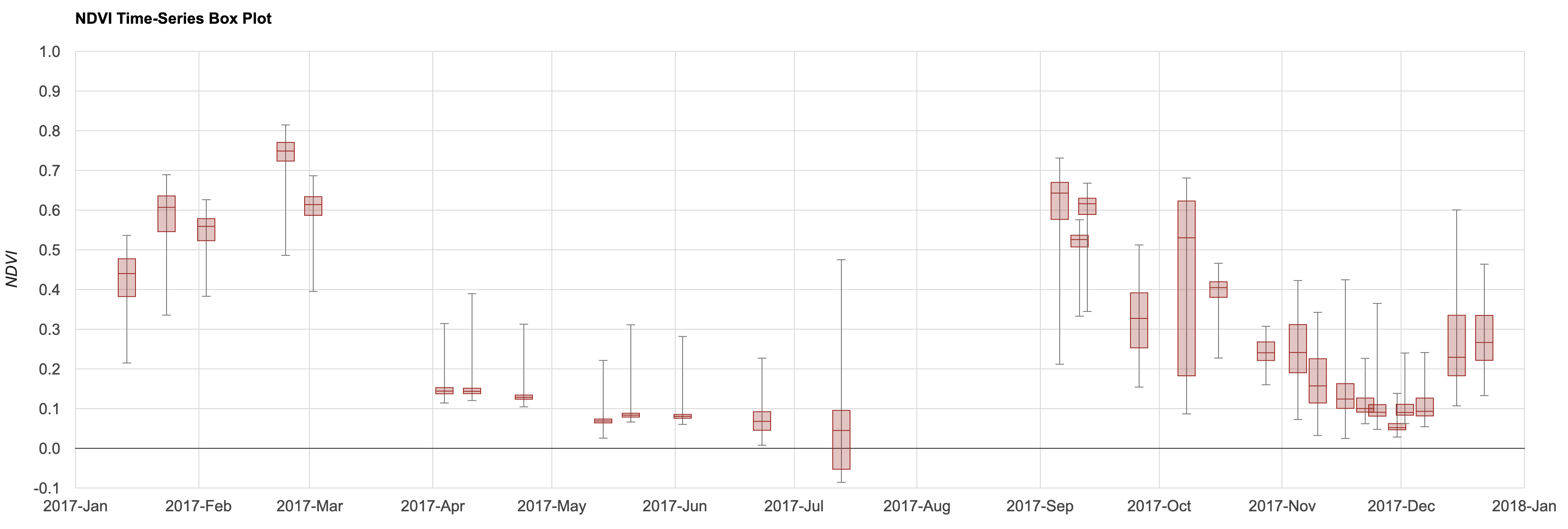
Exercise 02c
Exporting Charts
The charts produced by Google Earth Engine can be exported in SVG (Scalable Vector Graphics) format. This is a vector format that preserves the full-fidelity of the chart and can be converted to an image format at any resolution. Here are the steps to create a high-resolution graphic from your chart.
1 Once the chart is rendered in the Code Editor, click the arrow next to the chart to view it in a new tab.
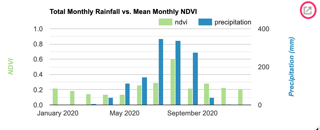
- Click the Download SVG button.
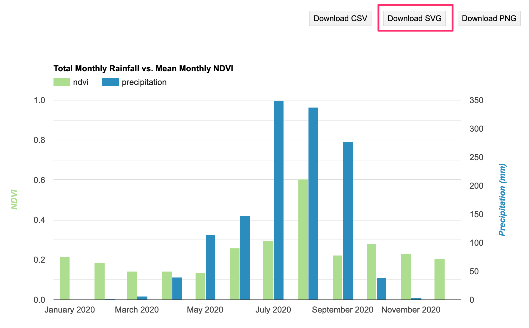
- You can open the resulting SVG in a graphics software and export it at a chosen resolution from there. You can also use free web-based tools. Visit https://www.svgviewer.dev/ and upload your SVG file.
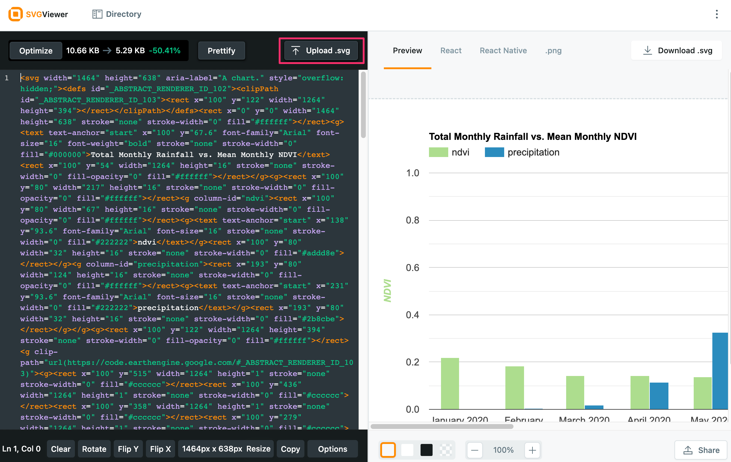
- Switch to the .png tab. Choose the scale factor. The higher the number the higher the resolution of the output file. Click Download .png button.
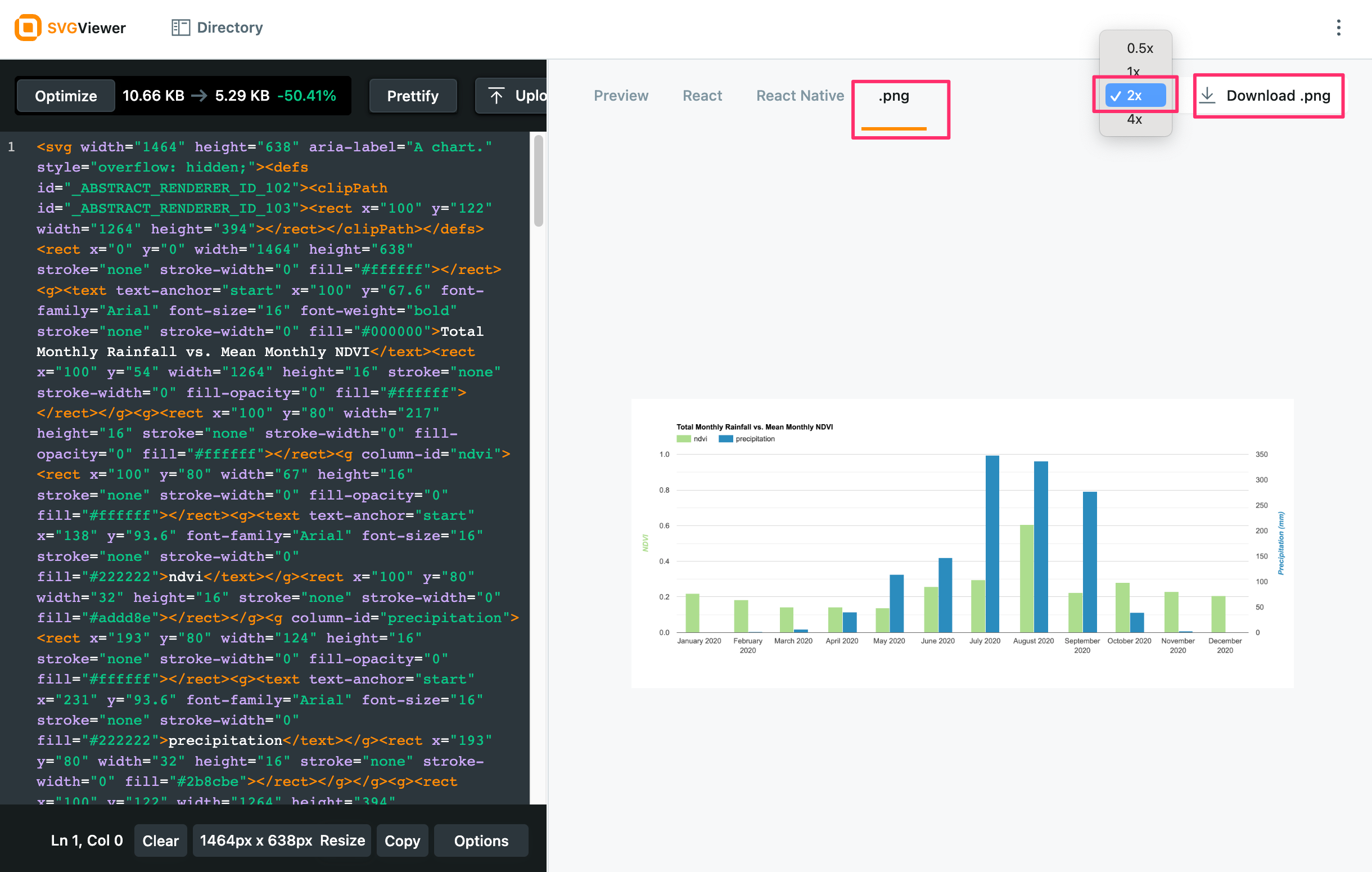
You now have a hi-resolution PNG image of your chart.
Supplement

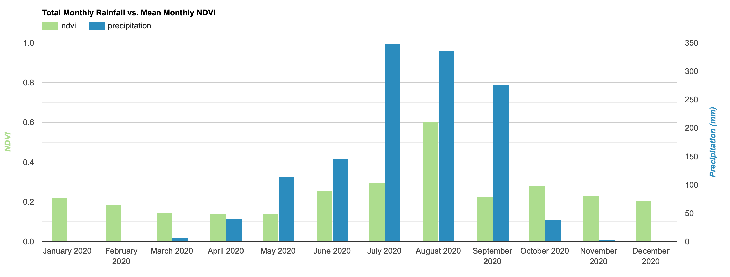
Dual Y-Axis Chart
When you are plotting 2 series on a chart that have very different
ranges - it makes sense to have 2 separate y-Axes. You can assign the
left axis to one series and right axis to another using the
series.targetAxisIndex option. Here’s an example of
plotting a monthly NDVI vs Rainfall time-series on the same chart.
Dual Y-Axis Chart
/**** Start of imports. If edited, may not auto-convert in the playground. ****/
var geometry = /* color: #00ff00 */ee.Geometry.Polygon(
[[[7.937819856526227, 10.723387714834615],
[7.938334840657086, 10.721922445898615],
[7.939160961033673, 10.722444251117416],
[7.938603061558576, 10.723767207790642]]]);
/***** End of imports. If edited, may not auto-convert in the playground. *****/
// Charting Rainfall vs NDVI
// Select a location
var geometry = ee.Geometry.Polygon([[
[7.9378, 10.7233],
[7.9383, 10.7219],
[7.9391, 10.7224],
[7.9386, 10.7237]
]]);
Map.centerObject(geometry, 16);
// Select a time period
var year = 2020;
var startDate = ee.Date.fromYMD(year, 1, 1);
var endDate = startDate.advance(1, 'year');
// Get NDVI from Sentinel-2
var s2 = ee.ImageCollection('COPERNICUS/S2_SR');
// Function to remove cloud and snow pixels from Sentinel-2 SR image
function maskCloudAndShadowsSR(image) {
var cloudProb = image.select('MSK_CLDPRB');
var snowProb = image.select('MSK_SNWPRB');
var cloud = cloudProb.lt(5);
var snow = snowProb.lt(5);
var scl = image.select('SCL');
var shadow = scl.eq(3); // 3 = cloud shadow
var cirrus = scl.eq(10); // 10 = cirrus
// Cloud probability less than 5% or cloud shadow classification
var mask = cloud.and(cirrus.neq(1)).and(shadow.neq(1));
return image.updateMask(mask);
}
var s2Filtered = s2
.filter(ee.Filter.date(startDate, endDate))
.filter(ee.Filter.bounds(geometry))
.map(maskCloudAndShadowsSR);
function addNDVI(image) {
var ndvi = image.normalizedDifference(['B8', 'B4']).rename('ndvi');
return image.addBands(ndvi);
}
var withNdvi = s2Filtered.map(addNDVI);
// Get Rainfall from CHIRPS
var chirps = ee.ImageCollection('UCSB-CHG/CHIRPS/PENTAD');
var chirpsFiltered = chirps
.filter(ee.Filter.date(startDate, endDate));
// Create a collection of monthly images
// with bands for ndvi and rainfall
var months = ee.List.sequence(1, 12);
var byMonth = months.map(function(month) {
// Total monthly rainfall
var monthlyRain = chirpsFiltered
.filter(ee.Filter.calendarRange(year, year, 'year'))
.filter(ee.Filter.calendarRange(month, month, 'month'));
var totalRain = monthlyRain.sum();
// Average NDVI
var monthlyNdvi = withNdvi.select('ndvi')
.filter(ee.Filter.calendarRange(year, year, 'year'))
.filter(ee.Filter.calendarRange(month, month, 'month'));
var averageNdvi = monthlyNdvi.mean();
return totalRain.addBands(averageNdvi).set({
'system:time_start': ee.Date.fromYMD(year, month, 1).millis(),
'year': year,
'month': month})
})
var monthlyCol = ee.ImageCollection.fromImages(byMonth);
print('Monthly Collection with NDVI and Precipitation', monthlyCol)
// We now create a time-series chart
// Since both of our bands have different ranges,
// we will create a chart with dual Y-Axis.
// Learn more at https://developers.google.com/chart/interactive/docs/gallery/columnchart#dual-y-charts
var chart = ui.Chart.image.series({
imageCollection: monthlyCol,
region: geometry,
reducer: ee.Reducer.mean(),
scale: 10,
}).setChartType('ColumnChart')
.setOptions({
title: 'Total Monthly Rainfall vs. Mean Monthly NDVI',
lineWidth: 0.5,
pointSize: 2,
series: {
0: {targetAxisIndex: 0, color: '#addd8e'},
1: {targetAxisIndex: 1, color: '#2b8cbe'},
},
vAxes: {
0: {title: 'NDVI', gridlines: {count: 5}, viewWindow: {min:0, max:1},
titleTextStyle: { bold: true, color: '#addd8e' }},
1: {title: 'Precipitation (mm)', gridlines: {color: 'none'},
titleTextStyle: { bold: true, color: '#2b8cbe' }},
},
hAxis: {
gridlines: {color: 'none'}
},
chartArea: {left: 100, right: 100}
});
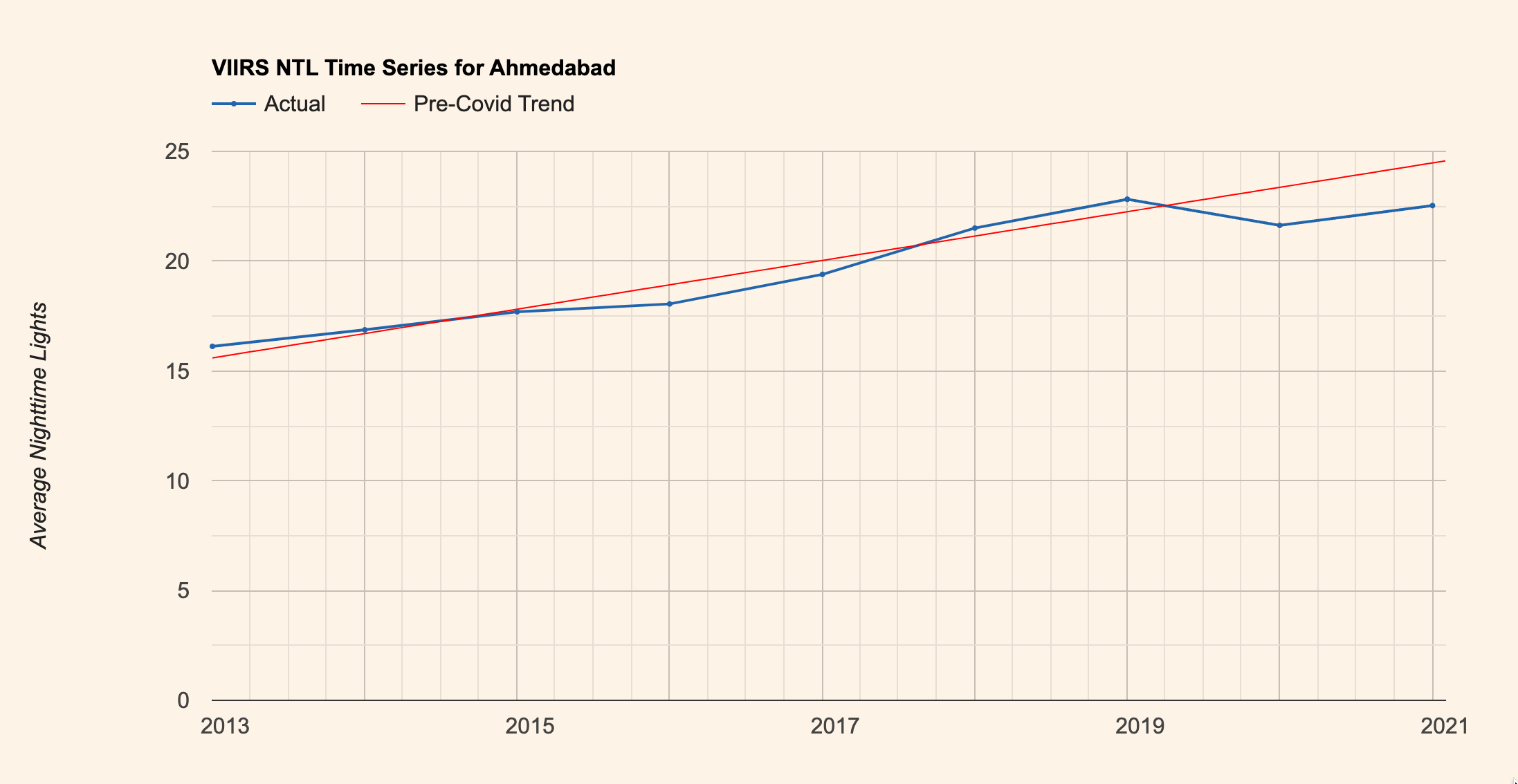
print(chart);Night Time Lights (NTL) Trends
The section on Time-Series with Trendlines covered how to add trendlines to the chart. We can apply this technique on a dataset of annual nighttime lights to see the effect of COVID19. We plot two series on a plot and display the trendline for the pre-covid series. This helps show the effect of COVID19 on the trend of nighttime lights.
Annual NTL Trend
// Plot Annual Night Time Lights trends
// Compare the Pre-Covid trend with Post-Covid observations
// Use Municipal boundaries from DataMeet
// http://projects.datameet.org/Municipal_Spatial_Data/
var cities = ee.FeatureCollection('users/ujavalgandhi/public/indian_cities');
// Select Annual NTL collection
var ntlCol = ee.ImageCollection('NOAA/VIIRS/DNB/ANNUAL_V21')
.select('average');
var resolution = ee.Image(ntlCol.first()).projection().nominalScale();
print('Input Resolution (m)', resolution);
var palette =['#253494','#2c7fb8','#41b6c4','#a1dab4','#ffffcc' ];
var ntlVis = {min:0, max: 63, palette: palette};
// Visualize the datasets
Map.centerObject(cities.first());
Map.addLayer(ntlCol.first(), ntlVis, 'NTL Image');
Map.addLayer(cities, {color: 'red'}, 'Cities');
// Define dates for pre-Covid and post-Covid
var preCovidStartDate = ee.Date.fromYMD(2012, 1, 1);
var preCovidEndDate = ee.Date.fromYMD(2020, 1, 1);
// Start the post-covid plot from 2019 for data continuity
var postCovidStartDate = ee.Date.fromYMD(2019, 1, 1);
var postCovidEndDate = ee.Date.fromYMD(2023, 1, 1);
var preFiltered = ntlCol
.filter(ee.Filter.date(preCovidStartDate, preCovidEndDate));
var postFiltered = ntlCol
.filter(ee.Filter.date(postCovidStartDate, postCovidEndDate));
// Rename bands
var preCovid = preFiltered.select(['average'], ['pre_covid']);
var postCovid = postFiltered.select(['average'], ['post_covid']);
// Merge collections
var collection = preCovid.merge(postCovid);
// Write a function to create a chart from the given city name
var createChart = function(cityName) {
print(cityName);
var geometry = cities.filter(ee.Filter.eq('Name', cityName)).geometry();
var chart = ui.Chart.image.series({
imageCollection: collection,
region: geometry,
reducer: ee.Reducer.mean(),
scale: resolution,
})
.setOptions({
title: 'VIIRS NTL Time Series for ' + cityName,
pointSize: 2,
lineWidth: 2,
vAxis: {
title: 'Average Nighttime Lights',
viewWindow: {min:0},
gridlines: {color: '#c7beb5'}
},
hAxis: {
title: '',
format: 'YYYY',
ticks: [
new Date(2013,0), // month indexing starts from 0
new Date(2015,0),
new Date(2017,0),
new Date(2019,0),
new Date(2021,0),
],
gridlines: {color: '#c7beb5'}
},
series: {
0: {color: '#2166ac', visibleInLegend: true, labelInLegend: 'Actual'},
1: {color: '#2166ac', visibleInLegend: false},
},
trendlines: {
1: {color: 'red', pointSize: 0, lineWidth: 1,
labelInLegend: 'Pre-Covid Trend', visibleInLegend: true}
},
legend: {
position: 'top'
},
backgroundColor: '#fef3e7'
});
return chart;
};
// We get a list of city names
var cityNames = cities.aggregate_array('Name');
print(cityNames);
// Call the function for each city name to create the chart
cityNames.evaluate(function(cityNames) {
for (var i = 0; i < cityNames.length; i++) {
var chart = createChart(cityNames[i]);
print(chart);
}
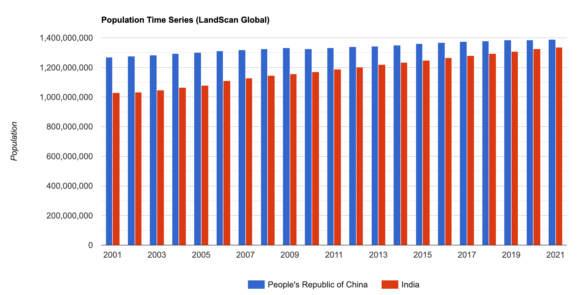
});Population Time Series
Earth Engine makes it very easy to plot variables over time and compare trends of different regions. Here we take the LandScan population dataset and compare the population of two countries over time.
Population Time-Series
// Plot a Population Time-Series

// Using GeoBoundries admin boundaries
var admin0 = ee.FeatureCollection("projects/sat-io/open-datasets/geoboundaries/CGAZ_ADM0");
var admin1 = ee.FeatureCollection("projects/sat-io/open-datasets/geoboundaries/CGAZ_ADM1");
var admin2 = ee.FeatureCollection("projects/sat-io/open-datasets/geoboundaries/CGAZ_ADM2");
Map.addLayer(admin0)

// Let's select 2 Admin0 regions to compare
var region1 = 'India';
var region2 = 'People\'s Republic of China';

var selectedRegions = admin0.filter(ee.Filter.inList('shapeName', [region1, region2]));
print('Filtered Admin0 collection', selectedRegions);

// We pick Landscan population dataset
var landscan = ee.ImageCollection("projects/sat-io/open-datasets/ORNL/LANDSCAN_GLOBAL");
var band = 'b1';

var startYear = 2001;
var endYear = 2023;

var startDate = ee.Date.fromYMD(startYear, 1, 1);
var endDate = ee.Date.fromYMD(endYear + 1, 1, 1);

var populationFiltered = landscan
  .filter(ee.Filter.date(startDate, endDate))
  .select(band);
print('Filtered Population Collection', populationFiltered);

// Extract the resolution of the population dataset
var projection = populationFiltered.first().projection();
var resolution = projection.nominalScale();
print('Population Data Resolution', resolution);

// Create a time-series chart comparing the population
var chart = ui.Chart.image.seriesByRegion({
  imageCollection: populationFiltered,
  regions: selectedRegions,
  reducer: ee.Reducer.sum(),
  scale: resolution,
  seriesProperty: 'shapeName'
}).setChartType('ColumnChart')
  .setOptions({
    title: 'Population Time Series (LandScan Global)',
    vAxis: {
      title: 'Population',
      // Set viewWindow so Y-axis starts from 0
      viewWindow: {
        min: 0
      }
    },
    hAxis: {
      title: '',
      format: 'YYYY',
      gridlines: {color: 'transparent'}
    },
    legend: {
      position: 'bottom'
    }
  });

print(chart);
Daily Time Series Chart
This example shows how to work with Sentinel-5p dataset to aggregate and plot a daily time-series of atmospheric concentrations. Many times when plotting a daily time-series, you would see an shift between the grid labels and the data points. This is because all the GEE datasets have the timestamps in UTC - while the charts are created using your browser’s timezone. The offset you see if due to the difference between your timezone and UTC. To avoid this - you can specify a timezone when working with dates in GEE as shown here.
Below is the list of new styling options applied to the time-series chart:
slantedTextandslantedTextAngle: Apply a rotation the axis labelsgridlines.units: Specify a date format for the tick labels
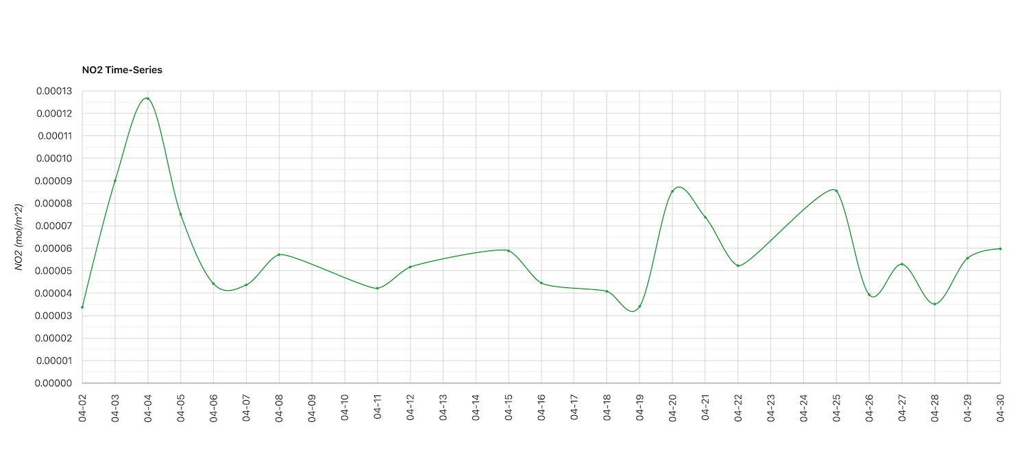
NO2 Daily Time-Series
// Example script showing how to use Sentinel-5p
// data and create a daily time-series of
// atmospheric concentrations for a chosen variable
// over a region.
// Choose the location
var geometry = ee.Geometry.Point([77.4294, 13.0708]);
// Choose the collection
var NO2 = ee.ImageCollection('COPERNICUS/S5P/NRTI/L3_NO2');
// Choose the start and end dates
// Default timezone for the dates is Earth Engine is UTC.
// Charts are created with your local timezone.
// For hourly or daily time-series, it is important to make
// sure the timezone for dates matches your browser timezone.
// otherwise you will see the data points shifted in the chart.
// You can specify your local timezone as IANA zone id
// https://en.wikipedia.org/wiki/List_of_tz_database_time_zones
// Here we specify the dates in timezone for India
var tz = 'Asia/Kolkata';
var startDate = ee.Date.fromYMD(2022, 4, 1, tz);
var endDate = ee.Date.fromYMD(2022, 5, 1, tz);
var NO2Filtered = NO2
.filter(ee.Filter.date(startDate, endDate))
.filter(ee.Filter.bounds(geometry))
.select('tropospheric_NO2_column_number_density');
// S5P captures multiple images in a single day
// Aggregate the collection to daily images
// Get a list of number of days
var days = endDate.difference(startDate, 'day');
var daysList = ee.List.sequence(0, days);
var result = daysList.map(function(day) {
var dayStart = startDate.advance(day, 'day', tz);
var dayEnd = dayStart.advance(1, 'day', tz);
var dayFiltered = NO2Filtered
.filter(ee.Filter.date(dayStart, dayEnd));
var dayMeanImage = dayFiltered.mean().rename('no2');
// Extract the spatial mean over the region
// Specify maxPixels and tileScale to enable
// computation over large region
var stats = dayMeanImage.reduceRegion({
reducer: ee.Reducer.mean(),
geometry: geometry,
scale: 1113.2,
maxPixels: 1e10,
tileScale: 16
});
// Some time periods have no matching images
// or they have nodata values
// We need to handle both these cases and
// set a nodata value of -9999
var dayMeanNO2 = ee.List([stats.get('no2', -9999), -9999])
.reduce(ee.Reducer.firstNonNull())
// Create a feature with the extracted value and date as properties
var f = ee.Feature(geometry, {
'no2': dayMeanNO2,
'date': dayStart.format('YYYY-MM-dd', tz),
'system:time_start': dayStart.millis()
});
return f;
});
// Remove any No Data values before charting
var no2Fc = ee.FeatureCollection(result)
.filter(ee.Filter.neq('no2', -9999));
print('Collection with Nulls Removed', no2Fc);
// Create a chart
var chart = ui.Chart.feature.byFeature({
features: no2Fc,
xProperty: 'system:time_start',
yProperties: ['no2']})
.setChartType('LineChart')
.setOptions({
interpolateNulls: false,
lineWidth: 2,
pointSize: 3,
series: {
0: {color: '#31a354'},
},
legend: 'none',
curveType: 'function',
title: 'NO2 Time-Series',
vAxis: {title: 'NO2 (mol/m^2)', viewWindow: {min:0}},
hAxis: {
title: '',
// Apply a rotation to display vertical labels on X-Axis
slantedText: true,
slantedTextAngle: 90,
gridlines: {
units: {
days: {format: ['MM-dd']},
},
},
minorGridlines: {
count:0
},
},
chartArea: {left:150, right:50}
});
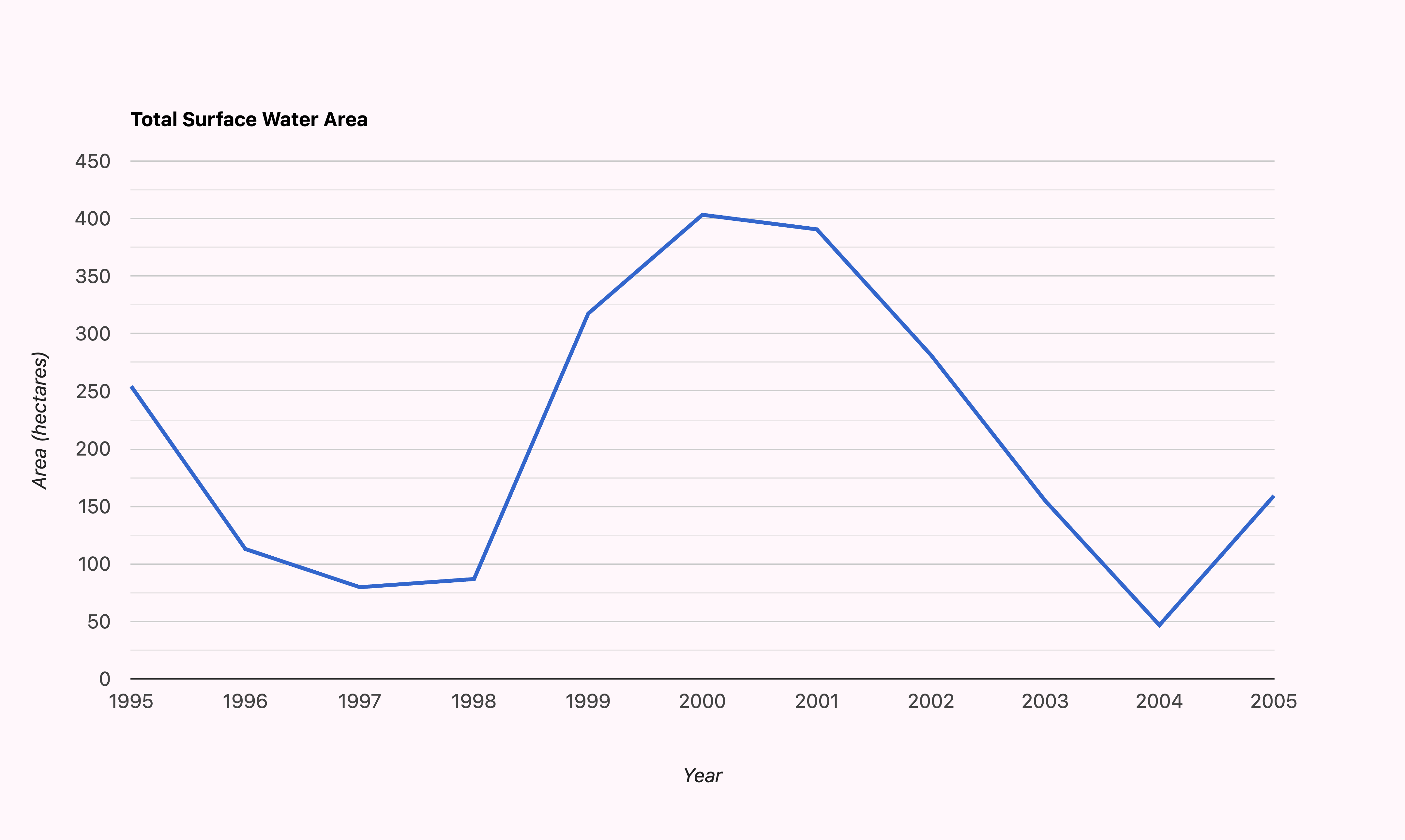
print(chart);Surface Water Area Time Series
The Global
Surface Water dataset is one of the best Landsat-derived
ready-to-use dataset for studying surface water. Using the JRC
Yearly Water Classification History, we can calculate the yearly
surface water area anywhere in the globe and create a time-series chart.
This example also shows how to customize the X-axis labels by supplying
a list of Javascript date objects for ticks parameter.
Surface Water Area Time-Series
// Example script showing how to calculate and plot
// a time-series of surface water area over a region
// using the Global Surface Water (GSW) Dataset.
// Define the area of interest
var geometry = ee.Geometry.Polygon([[
[77.4762, 13.1789],
[77.4762, 13.1398],
[77.5045, 13.1398],
[77.5045, 13.1789]
]]);
Map.centerObject(geometry);
Map.addLayer(geometry, {color: 'grey'}, 'Area of Interest');
// Use the GSW Yearly dataset
// We have yearly images from 1984 to 2021
var gswYearly = ee.ImageCollection('JRC/GSW1_4/YearlyHistory');
var startYear = 1990;
var endYear = 2021;
var startDate = ee.Date.fromYMD(startYear, 1, 1);
var endDate = ee.Date.fromYMD(endYear + 1, 1, 1);
var filtered = gswYearly.filter(
ee.Filter.date(startDate, endDate));
// Each image has a band named waterClass with 4 values
// | Value | Description |
// |-------|-----------------|
// | 0 | No Data |
// | 1 | Not Water |
// | 2 | Seasonal Water |
// | 3 | Permanent Water |
// We map() a function to select all pixels
// with value 2 and 3 (seasonal and permanent water)
var waterCol = filtered.map(function(image) {
var water = image.eq(2).or(image.eq(3));
// Unmask it to fill nodata with 0
return water.unmask(0)
.copyProperties(image, ['system:time_start']);
});
// Now we have binary images for each year
// Water pixels are value 1
// Visualize an image
var image = waterCol.first();
var waterVis = {min:0, max:1, palette: ['white', 'blue']};
Map.addLayer(image.clip(geometry), waterVis, 'Surface Water');
// We now multiply each image with ee.Image.pixelArea()
var waterColArea = waterCol.map(function(image) {
var waterAreaImage = image.multiply(ee.Image.pixelArea());
// The area is in square meters. Convert to hectares
return waterAreaImage.divide(10000)
.copyProperties(image, ['system:time_start']);
});
// Now we create a time-series chart
// We use ee.Reducer.sum() to get total surface water
// area for the Y-Axis
var chart = ui.Chart.image.series({
imageCollection: waterColArea,
region: geometry,
reducer: ee.Reducer.sum(),
scale: 30,
}).setChartType('ColumnChart')
.setOptions({
title: 'Total Surface Water Area',
color: '#3690c0',
pointSize: 0,
lineWidth: 3,
vAxis: {
title: 'Area (hectares)',
},
hAxis: {
title: 'Year',
gridlines: {color: 'none'},
},
legend: {
position: 'none'
},
backgroundColor: '#fff7fb',
chartArea: {left:100, right:100}
});
print(chart);
// The default chart has unwanted X-Axis labels
// To remove these, we must supply the list of 'ticks'
// with dates that we want labeled.
// Since charts are client side, we have to create
// this list of dates using Javascript.
// We generate list of years to use for charting
// and use evaluate() to create a client-side list
// Alternatively, you can just create a client-side
// list with javascript Date() objects
// var yearsList = [new Date(1990, 0), new Date(1995, 9) ..]
var years = ee.List.sequence(startYear, endYear, 5);
// evaluate() to get the year list on the client-side
years.evaluate(function(yearsList) {
var clientSideDates = [];
for (var i = 0; i < yearsList.length; i++) {
var date = new Date(yearsList[i], 0);
clientSideDates.push(date);
}
// Create the chart
var chart = ui.Chart.image.series({
imageCollection: waterColArea,
region: geometry,
reducer: ee.Reducer.sum(),
scale: 30,
}).setChartType('ColumnChart')
.setOptions({
title: 'Total Surface Water Area',
color: '#3690c0',
pointSize: 0,
lineWidth: 3,
vAxis: {
title: 'Area (hectares)',
},
hAxis: {
title: 'Year',
gridlines: {color: 'none'},
ticks: clientSideDates,
format: 'YYYY'
},
legend: {
position: 'none'
},
backgroundColor: '#fff7fb',
chartArea: {left:100, right:100}
});
print(chart);
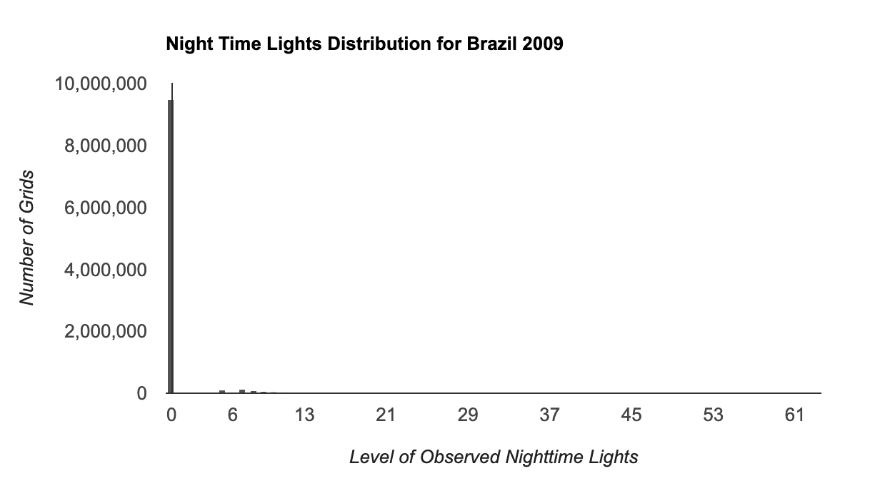
})Histogram with Reducer
If you wish to compute histogram for a large region, you need to
extract the image statistics using
ee.Reducer.fixedHistogram() and create a FeatureCollection
with the resulting values. This will allow you to Export large
computations and you can then import the resulting FeatureCollection and
use ui.Chart.feature.byFeature() to create the
histogram.
Histogram of a Large Image
// We use the Harmonized Global Night Time Lights (1992-2020) dataset
var dmsp = ee.ImageCollection('projects/sat-io/open-datasets/Harmonized_NTL/dmsp');
var viirs = ee.ImageCollection('projects/sat-io/open-datasets/Harmonized_NTL/viirs');

// Merge both collections to create a single Night Lights Collection
var ntlCol = dmsp.merge(viirs);

// Using LSIB for country boundaries
var lsib = ee.FeatureCollection('USDOS/LSIB_SIMPLE/2017');

var country = 'Brazil';
var selected = lsib.filter(ee.Filter.eq('country_na', country));
var geometry = selected.geometry();

var year = 2009;
var startDate = ee.Date.fromYMD(year, 1, 1);
var endDate = startDate.advance(1, 'year')

// We filter for the selected year
var filtered = ntlCol
  .filter(ee.Filter.date(startDate, endDate))

// Extract the image and set the masked pixels to 0
var ntlImage = ee.Image(filtered.first()).unmask(0);

var palette =['#253494','#2c7fb8','#41b6c4','#a1dab4','#ffffcc' ];
var ntlVis = {min:0, max: 63,  palette: palette}

Map.centerObject(geometry, 6);
Map.addLayer(ntlImage.clip(geometry), ntlVis, 'Night Time Lights ' + year);

// Extract the native resolution of the image
var resolution = ntlImage.projection().nominalScale();

// NTL images have DN values from 0-63
// We can create a histogram to show pixel counts
// for each DN value
// var chart = ui.Chart.image.histogram({
//   image: ntlImage,
//   region: geometry,
//   scale: resolution,
//   maxBuckets: 63,
//   minBucketWidth: 1})

// Fails
//print(chart);

// Let's extract the data using reduceRegion
// and ee.Recuer.histogram() reducer
var stats = ntlImage.reduceRegion({
  reducer: ee.Reducer.fixedHistogram({
    min: 0,
    max: 64,
    steps: 64}),
  geometry: geometry,
  scale: resolution,
  maxPixels: 1e10,
  tileScale: 16
})

// Extract the histogram values from the results
var bandName = 'b1';
var values = ee.Array(stats.get(bandName)).toList();

// Create a FeatureCollection
var histogramFc = ee.FeatureCollection(values.map(function(item){
  var itemList = ee.List(item);
  var bucket = itemList.get(0);
  var value = itemList.get(1);
  var nullGeom = geometry.centroid();
  return ee.Feature(nullGeom, {
    bucket: bucket,
    value: value
  })
}));
// For large computations, we can export the results
Export.table.toAsset({
  collection: histogramFc,
  description: 'Histogram_FeatureCollection',
  assetId: 'users/ujavalgandhi/ee_dataviz/histogram_fc'})

// Import the asset once export finishes
var histogramFcExported = ee.FeatureCollection('users/ujavalgandhi/ee_dataviz/histogram_fc');
print(histogramFcExported)

var chart = ui.Chart.feature.byFeature({
  features: histogramFcExported,
  xProperty: 'bucket',
  yProperties: ['value']
}).setChartType('ColumnChart')
.setOptions({
    title: 'Night Time Lights Distribution for ' + country + ' ' + year,
    vAxis: {
      title: 'Number of Grids',
      gridlines: {color: 'transparent'},
      //viewWindow: {min:0, max: 200000}
    },
    hAxis: {
      title: 'Level of Observed Nighttime Lights',
      ticks: [0, 6, 13, 21, 29, 37, 45, 53, 61],
      gridlines: {color: 'transparent'}
    },
    //bar: { gap: 1 },
    legend: { position: 'none' },
    colors: ['#525252']
  })
print(chart)
Histogram of Multiple Bands
If you wish to compute a multi-band histogram, we can follow the same
method used in the previous section Histogram with Reducer, but use the
ui.Chart.feature.groups() to create the plot.

Multi-band Histogram
// Create a histogram for multiple bands of a Sentinel-2 image

// Select the region
var geometry = ee.Geometry.Polygon([[
  [77.5765, 12.95640],
  [77.5765, 12.94018],
  [77.5966, 12.94018],
  [77.5966, 12.95640]
]]);

var s2 = ee.ImageCollection('COPERNICUS/S2_HARMONIZED');
// Filter the Sentinel-2 collection
var filteredS2 = s2.filter(ee.Filter.lt('CLOUDY_PIXEL_PERCENTAGE', 30))
  .filter(ee.Filter.date('2019-01-01', '2020-01-01'))
  .filter(ee.Filter.bounds(geometry));
// Sort the collection and pick the least cloudy image
var filteredS2Sorted = filteredS2.sort('CLOUDY_PIXEL_PERCENTAGE');
var image = filteredS2Sorted.first();

Map.centerObject(geometry, 10);
var rgbVis = {min: 0.0, max: 3000, bands: ['B4', 'B3', 'B2']};
Map.addLayer(image, rgbVis, 'Image');

// Select bands
// Pad the band names by 0 so they are sorted correctly
var bands = image.select(
  ['B11', 'B8', 'B4', 'B3', 'B2'],
  ['B11', 'B08', 'B04', 'B03', 'B02']);

// Let's extract the data using reduceRegion
// and ee.Recuer.histogram() reducer
var stats = bands.reduceRegion({
  reducer: ee.Reducer.fixedHistogram({
    min: 0,
    max: 5000,
    steps: 100}),
  geometry: geometry,
  scale: 10,
  maxPixels: 1e10,
  tileScale: 16
});

// We have a histogram for each band
// Get a list of bands and extract values

var bands = ee.List(stats.keys());

// Create a FeatureCollection
var histogramFc = ee.FeatureCollection(bands.map(function(band){
  var histogram = stats.get(band);
  var values = ee.Array(histogram).toList();
  var features = values.map(function(item) {
    var itemList = ee.List(item);
    var bucket = itemList.get(0);
    var value = itemList.get(1);
    // Exports require features to have a non-null
    // geometry. Create a geometry for the centroid
    var nullGeom = geometry.centroid({maxError: 1});
    return ee.Feature(nullGeom, {
      bucket: bucket,
      value: value,
      band: band
    });
  });
  return features;
}).flatten());

// For large computations, we can export the results

// Replace this with your asset id
var exportAssetId = 'users/ujavalgandhi/ee_dataviz/histogram_by_band_fc';

Export.table.toAsset({
  collection: histogramFc,
  description: 'Histogram_by_Band_FeatureCollection',
  assetId: exportAssetId
});

// Import the asset once export finishes
var histogramFcExported = ee.FeatureCollection(exportAssetId);

var chart = ui.Chart.feature.groups({
  features: histogramFcExported,
  xProperty: 'bucket',
  yProperty: 'value',
  seriesProperty: 'band'
})
.setChartType('AreaChart')
.setOptions({
    title: 'Histogram',
    vAxis: {
      title: 'Count',
      gridlines: {color: 'transparent'},
    },
    hAxis: {
      title: 'Pixel Values',
      gridlines: {color: 'transparent'}
    },
    lineWidth: 1,
    areaOpacity: 0.2,
    legend: { position: 'top' },
    // series values are sorted alphabetically
    series: {
      0: {labelInLegend: 'Blue', color: 'blue'},
      1: {labelInLegend: 'Green', color: 'green'},
      2: {labelInLegend: 'Red', color: 'red'},
      3: {labelInLegend: 'NIR', color: 'orange'},
      4: {labelInLegend: 'SWIR', color: 'purple'},
    },
    chartArea: {
        width: '70%',
        height: '70%'
    }
});

print(chart);
Precipitation Combo Chart
Google Charts also supports Combo Charts - where each series can be displayed with a different style. Here we create a chart with 2 series - monthly and cumulative precipitation. We can style each series independently using the style option. The script also shows how to add a border to the chart and adjust the margins to minimize whitespace.
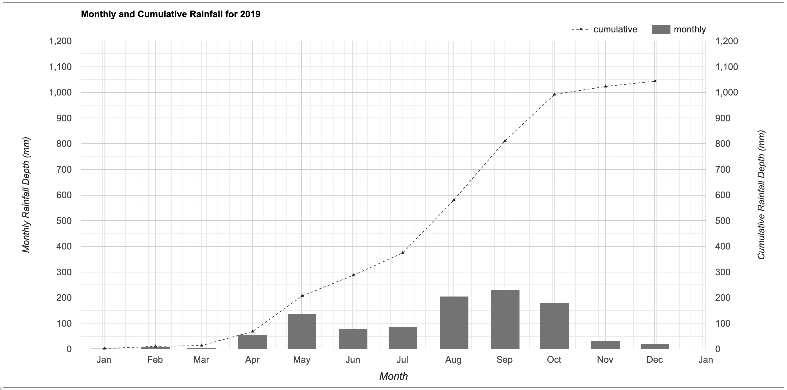
Precipitation Combo Chart
// Plotting Monthly and Cumumlative Rainfall

// Select a location
var geometry = ee.Geometry.Point(77.5946, 12.9716)

// Select a year
var year = 2019

// Use the CHIRPS precipitation dataset
var chirps = ee.ImageCollection('UCSB-CHG/CHIRPS/PENTAD');

// Create a list of months
var months = ee.List.sequence(1, 12)

// Write a function that takes a month number
// and returns a monthly image containing 2 bands
var createMonthlyImage = function(month) {
  var yearStartDate = ee.Date.fromYMD(year, 1, 1)
  var monthStartDate = ee.Date.fromYMD(year, month, 1)
  var monthEndDate = monthStartDate.advance(1, 'month')

  // Calculate Rainfall for the month
  var monthTotal = chirps
    .filter(ee.Filter.date(monthStartDate, monthEndDate))
    .reduce(ee.Reducer.sum()).rename('monthly')

  // Calculate Cumulative Rainfall
  var monthCumulative = chirps
    .filter(ee.Filter.date(yearStartDate, monthEndDate))
    .reduce(ee.Reducer.sum()).rename('cumulative');

  var image = ee.Image.cat([monthTotal, monthCumulative]);
  return image.set({
    'system:time_start': monthStartDate.millis(),
    'system:time_end': monthEndDate.millis(),
    'year': 2019,
    'month': month,
  });
};

// map() the function on the list  of months
// This creates a list with images for each month in the list
var monthlyImages = months.map(createMonthlyImage);

// Create an imagecollection
var monthlyCollection = ee.ImageCollection.fromImages(monthlyImages);
print(monthlyCollection);

// Create a ComboChart
// We will plot monthly rainfall as Bars
// and cumulative rainfall as a Line
var chart = ui.Chart.image.series({
  imageCollection: monthlyCollection,
  region: geometry,
  reducer: ee.Reducer.mean(),
  scale: 5566,
}).setChartType('ComboChart')
  .setOptions({
      title: 'Monthly and Cumulative Rainfall for ' + year,
      hAxis: {
        title: 'Month',
        titleTextStyle: {fontSize: 18},
        format: 'MMM', // Display the month name
        ticks: [
          new Date(2019, 0),
          new Date(2019, 1),
          new Date(2019, 2),
          new Date(2019, 3),
          new Date(2019, 4),
          new Date(2019, 5),
          new Date(2019, 6),
          new Date(2019, 7),
          new Date(2019, 8),
          new Date(2019, 9),
          new Date(2019, 10),
          new Date(2019, 11),
          new Date(2019, 12),
          ]
      },
      vAxes: {
        0: {
          title: 'Monthly Rainfall Depth (mm)',
          gridlines: {color: 'none'},
          viewWindow: {min:0, max: 1200}
        },
        1: {
          title: 'Cumulative Rainfall Depth (mm)',
          viewWindow: {min:0, max: 1200},

        },
      },
      seriesType: 'line',
      series: {
        0: {
          type: 'line',
          pointShape: 'triangle',
          pointSize: 5,
          lineWidth: 1,
          lineDashStyle: [4, 4],
          color: '#252525',
          targetAxisIndex: 1
        },
        1: {
          type: 'bars',
          color: '#737373',
          targetAxisIndex: 0
        },
      },
      legend: {
        position: 'top',
        alignment: 'end'
      },
      backgroundColor: {
          strokeWidth: 1
      },
      chartArea: {
        width: '80%',
        height: '80%'
      }
});
print(chart);
Transect Chart
You can sample values from an image along a line transect and generate a FeatureCollection with latitude, longitude and DN values. This can be then plotted to create a transect chart like below.
![]()
var transect = ee.Geometry.LineString([
  [139.0, 35.67],
  [140.5, 35.67]
]);

// Get VIIRS Annual NightTime Lights Image
var ntlCollection = ee.ImageCollection('NOAA/VIIRS/DNB/ANNUAL_V21');
var band = 'average';

// Select a year
var year = 2021;
var startDate = ee.Date.fromYMD(year, 1, 1);
var endDate = startDate.advance(1, 'year');
var image = ntlCollection
  .filter(ee.Filter.date(startDate, endDate))
  .select(band)
  .first();
// Rename the band to 'DN'
var image = image.rename('DN');
var resolution = image.projection().nominalScale();
// Visualize the Image
var palette =  ['000000', '584d9f','9c79c1','c98cbe','f2d192','e2ee82'];
var visParams = {min: 0.0, max: 80.0, palette: palette}
Map.centerObject(transect);
Map.addLayer(image, visParams, 'Night Lights ' + year);
Map.addLayer(transect, {color: 'red'}, 'transect');

// Generate Points along Line
var projection = 'EPSG:4326' // WGS84
var interval = 0.01 // Degrees
var tolerance = 0.001;
var totalLength = transect.length({proj: projection, maxError: tolerance});
var distances = ee.List.sequence(0, totalLength, interval);

// Divide the line into segments of equal length
var parts = transect.cutLines({
  distances: distances,
  proj: projection,
  maxError: tolerance});

// The result is a MultiLine geometry
// Get the individual geometries and create a point
// from the start point of each line segment
var points = ee.FeatureCollection(parts.geometries().map(function(part) {
  var startPoint = ee.Geometry(part).coordinates().get(0);
  var point = ee.Algorithms.GeometryConstructors.Point(startPoint);
  var coords = point.coordinates();
  return new ee.Feature(point, {'lat': coords.get(1), 'lon': coords.get(0)});
}));

Map.addLayer(points, {color: 'cyan'}, 'Points along transect');

// Extract the pixel values at each point
var samples = image.sampleRegions({
  collection: points,
  properties: ['lat', 'lon'],
  scale: resolution,
});
print('Extracted Values', samples.first());

// Plot the results
var chart = ui.Chart.feature.byFeature({
  features: samples,
  xProperty: 'lon',
  yProperties: 'DN'
}).setChartType('AreaChart')
  .setOptions({
    lineWidth: 1,
    pointSize: 0,
    title: 'Latitudinal Transect of Night Time Lights',
    titleTextStyle: {fontSize: 18},
    vAxis: {title: 'DN', gridlines: {color: 'transparent'}},
    hAxis: {title: 'Longitude', gridlines: {color: 'transparent'}},
    series: {
      0: {color: 'blue'},
    },
    legend: {position: 'none'},
    curveType: 'function',
    chartArea: {left: 100, right: 100},
    backgroundColor: 'transparent'
  })
print(chart);
Logo Chart
A Table chart allows you to add an image along with any HTML-formatted text. You can use this to display a logo and a description along with a chart in your app.
![]()
// Example script showing how to add logo to a chart

// Your logo needs to be converted to a Data URI
// i.e. the image is converted as an base64 encoded string
// Use a converter such as https://onlinepngtools.com/convert-png-to-data-uri
var logoString = 'data:image/png;base64,iVBORw0KGgoAAAANSUhEUgAAAFAAAABQCAYAAACOEfKtAAAAAXNSR0IArs4c6QAAAARnQU1BAACxjwv8YQUAAAAJcEhZcwAALiMAAC4jAXilP3YAAAvzSURBVHhe7Z15dFTVHce/M5nJZLJhJgtmJwHZV1EWjUelWg+oFYWCPZx6qD3uiNJK3f3D01OqLS4QBaPi0lZRVNQerQqC4hYUgUAWMAtJyL6HJLO82Xp/d26YLDMhk/cmDOe8T847ub87793MfOd3998FjdPp7AagZ5dK4NhJQJtGowkXGSoB4Ha7Ja1Iq4wQVUCZqALKRBVQJqqAMlEFlIkqoExUAWWiCigTVUCZqALKZNTnwi63C4VtR1DQehi1PSdhcVgQEWZEalQqZsbPZtcsaDVh4u7QhubCoyrg3tov8XbZv9BobhA5g0k0JuHmCavwq7RfQ8N+QplRE9DqtOCZgqexv/EHkXNm5iZejAdmP4RIXZTICT1GRUDJacMTPz2CkvYikTN8LhgzCX+d/xSr4hEiJ7QYleWsvOItIxKPKO08jhcLNwkrNAmqB5JwD+X/WVheYvSxuCn7t5g/diFMhni029rwY1M+PqjYgU6pQ9zl5cl5GzArfo6wQoege+D7Fe+KlJe06HQ8n/MiFzA1Kg1GnREprAdemrWM5W9BZkyWuNPL++WDywkVgiZgj6MHB5sPCMuDTqvDwxc+gfiIBJHTnzhDHB5hr4dr+1eII20FPj0zFAiagKUdx+F0O4XlYeHYHKRFpQvLN+dHJuOylCuE5cHNxo7HO44JyzfVFhdyKyT84ZAFi3/owXX5PbizwILXqyW0SW5xl/IETcAmS6NIeZlumiFSQzPNx32+yiOqzC6sPGBG9q4urD1qwRtMsM+bHPi00YG8Sgm3MkHTvujCfey1DrvyQgZNQMcA7yMMYQaRGhqDdvB9TpdDpLx83GDHrL3d2FFrZzMckekDq9ONzcw7Z7N7D3cOfl9yCJqAsaynHUgNm7oNB5riDSQmfIxIeSDxlv9oxinH8L2Kqvmi73pw9JRyIgZNwKzYbJHysq/uKzhcdmH5htrNr+r2CMtLVp/euZJV29//bGFeLjICgKoxCW9mXqkEQROQhijJkSnC8kDt2BvHtwnLN2+Vvom6nlpheUiISMS4Pl/I+iIrukainqC0x4WNZZKw5BE0AYklmdeJlJePK3di09FncErqFDkeuuxdfNbxXvk7IsfL4oxrTy8skPftrB/ai4dDboUNkksYMgjqTMTqtOKOr1ejwzZ4DKdnY70pcVM9MxGpjc9aJOdgr4jRxyDvitdPLyo8X27DukIrT8tl96VRWJSgE1bgBH0mQosAK8evElZ/7C4JR1oPs/buSxS0HPIpHrF8/Mp+KzIHOpTrAA60yy8rqAIS12QsQUZ0prACg9rQazNvEJaHBpsyjT+hRFlBFzBME4Y7pt0zosVRek6v7R95p+QSqxIfPugCEtNNM3FV+jXCGh6XpyzCnIS5wvKSblTuLacZ5X8doyIgcevk25DIhiPDIc5gwm1T7xJWf+bHKbdfsiBu5B1IL6MmIHUE9818AKzHFzm+oap+74x1vPf1xdJkPcIVeNeZkVrMU+DLUFxAl9uBblsdzFIj3OynLzPiZ2FZ1gph+eb6cUv5fog/kgwarM6QP+paP8EArQINqmLjQJujE0cbXkd1+142XbPwvAhdHCYkXI/JSSvYm/V0BjRVe2z/X1DsY5mf9kD+vuCf0A3oOAbSIrn5IkK9dWQjYWoGvrksGjqZAiq2qdQjNWBv+XrmdU0ipz8JUdNxefbfECZWWdqsrVj3/Ro2wG7nNhEbHotnLsnl25rD4Uc2hrv6+56Ap3TjWNX9JicKqQp0RgoNpN3Ir9rgVzyipacQBfWvCAswRcTjwTmP8RVqgoY662c/MmzxCGq/9rCZBLVlw4We2aeQeL3ILqmpuwCt5qFXi4mK1k8hOU4JC5gaNw13TlvD03+ccgePSgiUueeF4ciV0Xh4ogFxev/1kYY+z88w4ltWbdMUFI+QXYWLGt5EUeN/hDU0OVlPIiV2vrA8VHadwDgfG0mBQs3hVy0O/Mymeg3MoA6ChFvAvG6hSce8XNyoIIq0gYfrtuKX5p3CGpr5GQ8iM26RsPxT3mjBjvwmHDzRhU6zA3HRelyUHYMVC5KQkRA6m+yKCFja8iEO1W4R1tAsmvAs61CmCmswVrsLj26vwGtf18PlY41ex9zo7qtT8fiyLOiD4VIBokgnkhq7kA2OzzwgjdQnIj5ykrAGY5VcuGnjUby6t86neITD6camz2qwanMRT4cCsgWMDB+LSYnLheWf2al3Din0o+9U4Ptf+i+y+uOLI23Y8FGVsM4uinRJM5JXswHzb4TVHxpAz01bi7QxOSJnMNTmUbUNhFzmiQ0dyizLy0GxmQhBw5nKtl04Zati34wOpsiJyIpfjOjwZHGHb8ibnhqBR2343XjcxdrEs4ViMxG5rHiukFfLQKFeOe/2ycIafRSaicingw1VRsJIn1OSkBDQFDWy894mNj4824SEgBeN9732dyZocH22CQkBqS2jQXIgGMO1WHrx8Fa4g0lICEjTs0B70weuy0BCjFqFT/MEm55dPdMkrKG5aV4i1l07dJzhaBESw5he7Gx6tuHDKuR+XgPJMXi1maoteR6Jpz3D3spoEDLjwIHQDGPnT82DVmNuZG1eKFTbXkJWwHOFkBlIn8sM6YHF7YX8DMfM+Dl+92mHA+3E0TUw+r6XBnM9TBHJ2Nvi6LcRmhiuQXaUFlYnkByhbJtX3OXC1Bh5/jOkB+4o346T3dX8UMxLRbnottO/EDV8jnUU41h7MU+Xdf4y6MhDX+iAjdXlxqFOJ75tdeDeIxYc6nDiWLcL/2t04K0a5VddbvnZLFJevmF/e0ddYLGHfgWkaNIrU6/imz33z1yPKL0nxIy85aMTH+CHxu9Ob5xLLgm7a77Ap1X/RZf9FPe2gpbDONx6EM2WZn50ITNmHL+3U+rEJ1UfY0/tbtj7hPvG6jR46AID7htv4DtttFG0Ks3TYTRJbmyqkPAe+3C9Hkqx0S9XSfzq3drc1exgZfIkj4OmmGiCIlKfK7fhw3rv8/T7owY7jzestbq4vZs9v6vJgZPsOVqv3V5r58HpNaIcX/gVkE4SvVK8FdtK8pg3lfCQCxJvR/nbuOT8HG5vL/03v3cr89CM6AweebC16AUuDG1V0qXVaFHbU4MS5o10avPl4i2YnXAhkpmoecUv8ufPxJfsg13AqjIdXyAhaMH6+nwzDOzd03XDfjPoIz5bZkObOMpAxxz2tzlRxsRbfdCMidFhyG934vEST3Bmvc2Fk2Y3zo/Q8rKYiSabG+3s+U52vXFS4s9TE/JqtX+v9CsgxebdPX0tbpl0K75r2Ifqrkp+nu2GrGV8/3bB2EvQxtpHOkEUb4jHxPMmI52JeHHSPF5lM2Iy+bGt+Ih4USJrd9qKkJN8GY+fnhI3DcYwI8yOwVVpIDen6rF4rA6PMa/c1+rkHkUb5Lekh/MrlbWP5SzPF58wL1uTZcAS9vyGqRHcy4hkpvya7HCsZGVnsbIoyoGiVWkXb3psGHJMOhzvcfJw4iVJ/oOQ/Aq4p3YX/02b35POm4JWWyv3LBKSoDRF3FPQUIu1hecRVV1V/DWK66MQ374kGhPZ870Lp25UdVfyMgbG0Aykt/ugUAzyPoqPKWMfjmKc6aowu5DEOpxEJkpptyfqlKohQZvo1LYSJ5jIzT6CKnvLpaCl3mMTEst496JIPDnZgNsLPKEqvvArYDTrdTcd3YgtRZu5R/VufJd1lmLbsTxWVTfjxqzlXKhLmVe9UPgcXi15if1hGz9ASKeNKHT367o9/Eh/FBM6PTqTtaXReKn4BbxcspWfmaMvKMk49vTRBlajkN0n2sDEhfFIGBGmQYZRwzfR12Yb+JEuuu5n6TEs71HmoY8fs/G8aoubP3tjsp63kRQGkntCQoIoa1K092/QZnskK/uqRB3fV/4HawoqWfWmpmH1QcvpttgXAQ2kqbekqkunK88VKpjXvVYt4U8TDLyD+Ixd2+YYxavyCHggnRKVwqpspLDODagTmBIThntYNaSeefMMZTfm1amcDNSpnAKoAspEFVAmqoAyUQWUiSqgTFQBZaIKKBNVQJmoAspEFVAmNBdW/zuMEQP7/wGOmgqkDqIi/QAAAABJRU5ErkJggg=='
 var dataTable = {
  cols: [
    {id: 'logo', label: '', type: 'string'},
  ],
  rows: [
    {c: [ {v: '<img src=' + logoString + '>'}]},
    {c: [ {v: 'A chart with a logo and description.'}]}

    ]
  };
var logoChart = ui.Chart(dataTable, 'Table')
  .setOptions({
    allowHtml: true,
    alternatingRowStyle: false,
    width:'100'})
;

// Create a Chart

// We will create a chart showing some data points

var data = ee.List([[1,4], [2,5], [3,7], [4,8], [5,12]])

// Convert x and y variable to lists
var x = data.map(function(element) { return ee.List(element).get(0)});
var y = data.map(function(element) { return ee.List(element).get(1)});

// Build a simple linear regression model
// 1 independent (x) and 1 dependent (y) variable
var model = data.reduce(ee.Reducer.linearFit())

var scale = ee.Dictionary(model).get('scale')
var offset = ee.Dictionary(model).get('offset')

var yPredicted = ee.Array(x.map(function(element) {
  var y = (ee.Number(element).multiply(scale)).add(offset);
  return y;
}));

// Concatenate the y variables (y and predicted y) into an array
// for input to ui.Chart.array.values for plotting a scatter plot.
var yArr = ee.Array.cat([y, yPredicted], 1);

var dataChart = ui.Chart.array.values({
  array: yArr,
  axis: 0,
  xLabels: x})
  .setChartType('ScatterChart')
  .setOptions({
    legend: {position: 'none'},
    hAxis: {'title': 'x'},
    vAxis: {'title': 'y'},
    series: {
      0: {
        pointSize: 5,
        pointShape: 'triangle',
        lineWidth: 0,
      },
      1: {
        pointSize: 0,
        lineWidth: 1,
      }
    },
    chartArea: {left:20, right:10},
    width: '300'
});

var mainPanel = ui.Panel({
  layout: ui.Panel.Layout.flow('horizontal'),
  style: {width: '500px'}
});

mainPanel.add(logoChart)
mainPanel.add(dataChart);

Map.add(mainPanel)
Stacked Bar Chart (DataTable)
You can use the isStacked option to true on
charts of type ColumnChart or BarChart to create a
stacked chart. We continue with the dataset from the section on DataTable charts and create a stacked bar
chart.
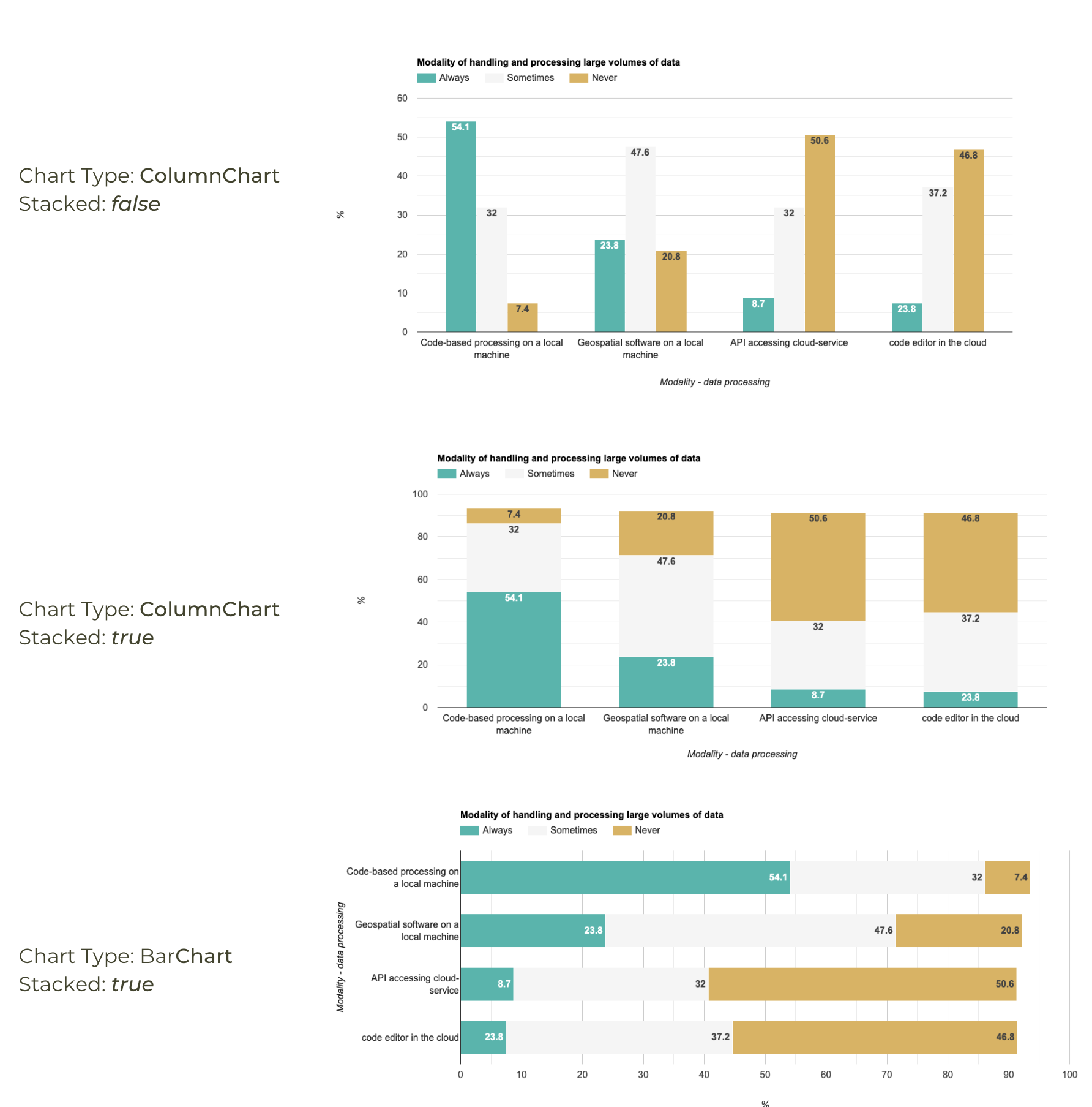
Regular vs. Stacked Bar Charts
// Creating Stacked Bar Charts

// We use the Big Earth Data - Survey 2019 data
// https://zenodo.org/record/4075058

// Create a DataTable
var dataTable = {
  cols: [
    {id: 'modality', label: 'Modality - Data Processing', type: 'string'},
    {id: 'always', label: 'Always', type: 'number'},
    {id: 'alwaysAnnotation', label: 'Always', type: 'string', role: 'annotation'},
    {id: 'sometimes', label: 'Sometimes', type: 'number'},
    {id: 'sometimesAnnotation', label: 'Sometimes', type: 'string', role: 'annotation'},
    {id: 'never', label: 'Never', type: 'number'},
    {id: 'neverAnnotation', label: 'Never', type: 'string', role: 'annotation'},

  ],
  rows: [
    {c: [ {v: 'Code-based processing on a local machine'},
          {v: 54.1}, {v: '54.1'}, {v: 32}, {v: '32'}, {v: 7.4}, {v: '7.4'}]},
    {c: [ {v: 'Geospatial software on a local machine'},
          {v: 23.8}, {v: '23.8'}, {v: 47.6}, {v: '47.6'}, {v: 20.8}, {v: '20.8'}]},
    {c: [ {v: 'API accessing cloud-service'},
          {v: 8.7}, {v: '8.7'}, {v: 32}, {v: '32'}, {v: 50.6}, {v: '50.6'}]},
    {c: [ {v: 'code editor in the cloud'},
          {v: 7.4}, {v: '23.8'},{v: 37.2},{v: '37.2'}, {v: 46.8}, {v: '46.8'},]},
    ]
};

// Use ui.Chart() to create a column chart
var chart = ui.Chart(dataTable, 'ColumnChart')
  .setOptions({
    title: 'Modality of handling and processing large volumes of data',
    vAxis: {title: '%'},
    hAxis: {title: 'Modality - data processing'},
    legend: {position: 'top'},
    series: {
      0: {color: '5ab4ac'},
      1: {color: 'f5f5f5'},
      2: {color: 'd8b365'}
    },
    annotations: {
      textStyle: {bold: true},
    }
  });

// Print the chart
print(chart);


// Use ui.Chart() to create a stacked bar chart
// Set the option isStacked: true
var chart = ui.Chart(dataTable, 'BarChart')
  .setOptions({
    title: 'Modality of handling and processing large volumes of data',
    hAxis: {title: '%'},
    vAxis: {title: 'Modality - data processing'},
    legend: {position: 'top'},
    isStacked: true,
    series: {
      0: {color: '5ab4ac'},
      1: {color: 'f5f5f5'},
      2: {color: 'd8b365'}
    },
    annotations: {
      textStyle: {bold: true},
    }
  });

// Print the chart
print(chart);
Colored Bar Chart (DataTable)
It is possible to assign a different color to each bar of a bar chart. You neeed to create a DataTable with a column having a style role and define the color for each row. Here we create a chart that uses a unique color for each bar that representing the year of forest loss. The chart has a one-to-one correspondence with the map palette - making it a very useful tool in interpretation of the spatial and temporal aspects of the trend.
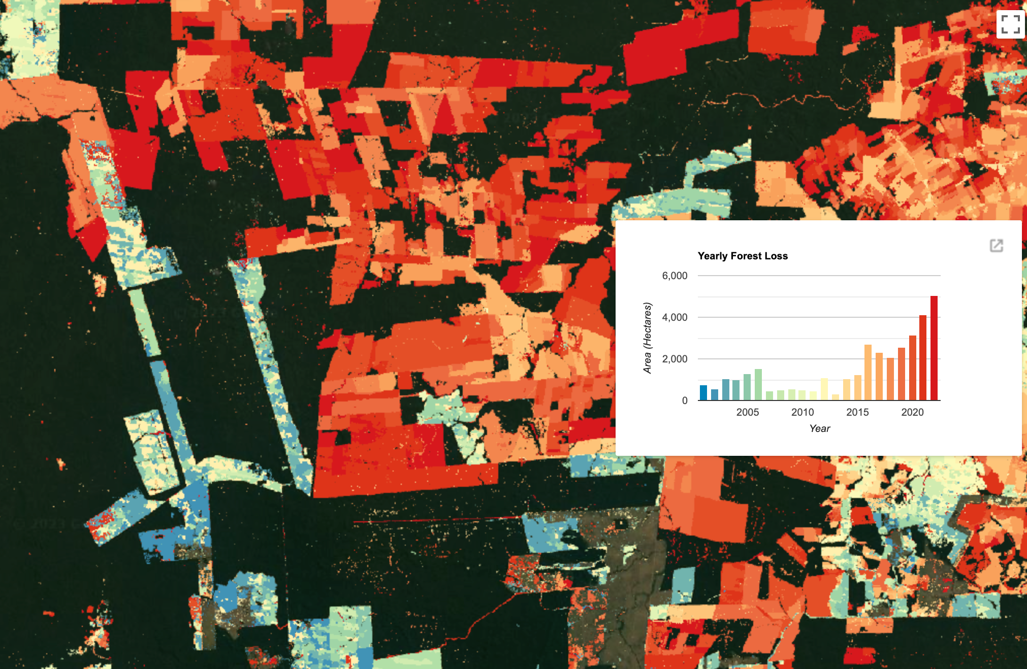
Colored Bar Chart
// Example script showing how to create a bar chart
// with each bar having a different color.

// We create a map of forest loss with each pixel
// colored accoridng to the year in which the loss occurred.
// The chart displays the total loss in the region by year
// with the color or the bar matching the map.

// Select a region
var geometry = ee.Geometry.Polygon([[
  [-66.31185532393005, -8.92550265818768],
  [-66.31185532393005, -9.687127927480695],
  [-65.2104759293988, -9.687127927480695],
  [-65.2104759293988, -8.92550265818768]
]]);

// Get the Hansen Global Forest Change dataset
// This dataset is updated yearly, so we get the latest version.
var gfc2022 = ee.Image('UMD/hansen/global_forest_change_2022_v1_10');

var lossYear = gfc2022.select(['lossyear']);

// The lossYear image contains pixel values from 0 to 22
// indicating the year in which the loss occurred

// We visualize this layer on the map.
var palette = [
  '0083ba', '#4394b6', '#5ca5b2', '#74b6ad', '#8dc8a9',
  '#a5d9a5', '#b7e2a8', '#c7e8ad', '#d7efb2', '#e7f5b7',
  '#f7fcbc', '#fff7b6', '#fee8a4', '#fed890', '#fec980',
  '#fdba6e', '#fba75e', '#f48b51', '#ed6e43', '#e5522a',
  '#de3519', '#d7191c'];

var lossYearVis = {
  min: 0,
  max: 22,
  palette: palette
}
// Visualize the loss on the map
Map.centerObject(geometry, 10);
Map.setOptions('SATELLITE');
Map.addLayer(geometry, {}, 'Selected Region', true, 0.6);
Map.addLayer(lossYear, lossYearVis, 'Loss Year');

// Create an area image and convert to Hectares
var areaImage = ee.Image.pixelArea().divide(1e5);

// Add the band containing yearly loss
var areaImageWithYear = areaImage.addBands(lossYear);

var areas = areaImageWithYear.reduceRegion({
  reducer: ee.Reducer.sum().group({
    groupField: 1,
    groupName: 'year'
    }),
  geometry: geometry,
  scale: 30,
  maxPixels: 1e10
});

var yearAreas = ee.List(areas.get('groups'));

// Process results to extract the areas and
// create a list
var yearAreasList = ee.List(yearAreas.map(function(item) {
  var areaDict = ee.Dictionary(item);
  var yearString = ee.Number(areaDict.get('year')).format('20%02d');
  var area = ee.Number(
    areaDict.get('sum'));
  return ee.List([yearString, area])
}));

print('Year Areas', yearAreasList);


// We create a list of rows in the DataTable format
var rowList = yearAreasList.map(function(item) {
  var year = ee.List(item).get(0);
  var x = ee.String('Date(')
    .cat(year)
    .cat(', ')
    .cat('0')
    .cat(', ')
    .cat('1')
    .cat(ee.String(')'))

  var y = ee.List(item).get(1);
  // We will assign the color to each year from the palette
  var color = ee.List(palette).get(yearAreasList.indexOf(item));
  var rowDict = {
    c: [{v: x}, {v: y}, {v: color}]
  };
  return rowDict;
});

print('Rows', rowList);

// Create the DataTable
rowList.evaluate(function(rowListClient) {
  var dataTable = {
    cols: [
      {id: 'x', type: 'date'},
      {id: 'y', label: 'area', type: 'number'},
      {id: 'style', label: 'Style', type: 'string', role: 'style'},

    ],
    rows: rowListClient
  };

  var options = {
    title: 'Yearly Forest Loss',
    vAxis: {
      title: 'Area (Hectares)',
    },
    hAxis: {
      title: 'Year',
      gridlines: {color: 'transparent'}
    },
    legend: {position:'none'},
    height: '400px',
    width: '600px'
  };

  var chart = ui.Chart(dataTable, 'ColumnChart', options);
  // Add the chart on the map
  var chartPanel = ui.Panel({
    style: {width: '600px', position: 'middle-right'}
  });
  chartPanel.add(chart);
  Map.add(chartPanel);
});
Box Plot with Outliers (DataTable)
Regular box plot displays the whiskers at the minimum and maximum values. A variation of this is to instead first compute the Inter-Quartile Range (IQR) and display whiskers at 1.5 x IQR above and below the IQR. If the minimum or maximum values fall outside of this range, they are displayed as outlier points. This script calculates the requires values and displays the outlier intervals as points.
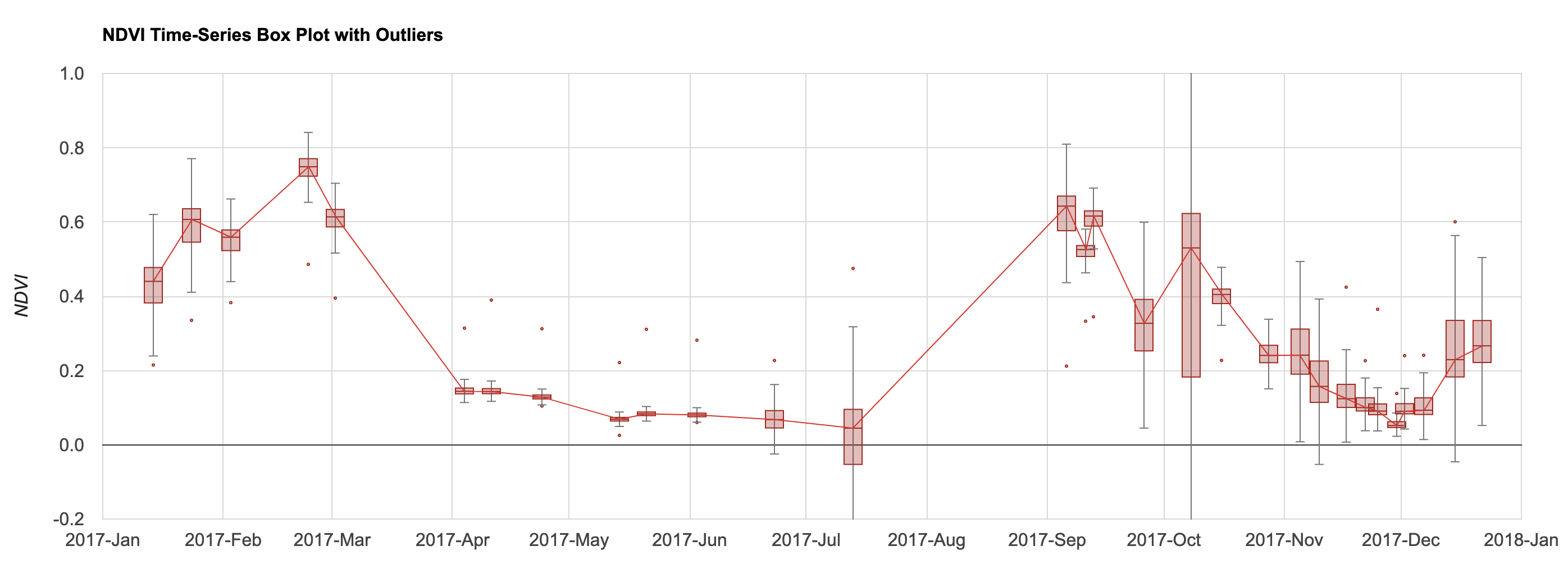
Box Plot with Outliers
// Example script showing how to create a box plot with outliers.
var s2 = ee.ImageCollection('COPERNICUS/S2_HARMONIZED');
var geometry = ee.Geometry.Polygon([[
  [82.60642647743225, 27.16350437805251],
  [82.60984897613525, 27.1618529901377],
  [82.61088967323303, 27.163695288375266],
  [82.60757446289062, 27.16517483230927]
]]);

Map.addLayer(geometry, {color: 'red'}, 'Farm');
Map.centerObject(geometry);
var rgbVis = {min: 0.0, max: 3000, bands: ['B4', 'B3', 'B2']};

var filtered = s2
  .filter(ee.Filter.date('2017-01-01', '2018-01-01'))
  .filter(ee.Filter.lt('CLOUDY_PIXEL_PERCENTAGE', 30))
  .filter(ee.Filter.bounds(geometry));

// Write a function for Cloud masking
function maskS2clouds(image) {
  var qa = image.select('QA60');
  var cloudBitMask = 1 << 10;
  var cirrusBitMask = 1 << 11;
  var mask = qa.bitwiseAnd(cloudBitMask).eq(0).and(
             qa.bitwiseAnd(cirrusBitMask).eq(0));
  return image.updateMask(mask).multiply(0.0001)
      .select('B.*')
      .copyProperties(image, ['system:time_start']);
}

var filtered = filtered.map(maskS2clouds);
// Write a function that computes NDVI for an image and adds it as a band
function addNDVI(image) {
  var ndvi = image.normalizedDifference(['B8', 'B4']).rename('ndvi');
  return image.addBands(ndvi);
}

// Map the function over the collection
var withNdvi = filtered.map(addNDVI);

// Extract the values from each image
var values = withNdvi.map(function(image) {
  var ndvi = image.select('ndvi');

  var allReducers = ee.Reducer.median()
    .combine({reducer2: ee.Reducer.min(), sharedInputs: true} )
    .combine({reducer2: ee.Reducer.max(), sharedInputs: true} )
    .combine({reducer2: ee.Reducer.percentile([25]), sharedInputs: true} )
    .combine({reducer2: ee.Reducer.percentile([50]), sharedInputs: true} )
    .combine({reducer2: ee.Reducer.percentile([75]), sharedInputs: true} )

  var stats = ndvi.reduceRegion({
    reducer: allReducers,
    geometry: geometry,
    scale: 10});
  var date = image.date();
  var dateString = date.format('YYYY-MM-dd');

  var properties = {
    'date': dateString,
    'median': stats.get('ndvi_p50'), // median is 50th percentile
    'min': stats.get('ndvi_min'),
    'max': stats.get('ndvi_max'),
    'p25': stats.get('ndvi_p25'),
    'p50': stats.get('ndvi_p50'),
    'p75': stats.get('ndvi_p75'),
  }
  return ee.Feature(null, properties)

})
// Remove null values
var values = values.filter(ee.Filter.notNull(
  ['median', 'min', 'max', 'p25', 'p50', 'p75']));
print(values)

// Format the results as a list of DataTable rows

// We need a list to map() over
var dateList = values.aggregate_array('date');

// Helper function to format dates as per DataTable requirements
// Converts date strings
// '2017-01-01' becomes 'Date(2017,0,1)'
// month is indexed from 0 in Date String representation
function formatDate(date) {
  var year = ee.Date(date).get('year').format()
  var month = ee.Date(date).get('month').subtract(1).format()
  var day = ee.Date(date).get('day').format()
  return ee.String('Date(')
    .cat(year)
    .cat(', ')
    .cat(month)
    .cat(', ')
    .cat(day)
    .cat(ee.String(')'));
}

// We will compute the values to display whiskers
// at 1.5*(Inter-Quartile Range)
// If the minimum or maximum values fall outside
// if this range, they will be considered outliers.
var rowList = dateList.map(function(date) {
  var f = values.filter(ee.Filter.eq('date', date)).first();
  var x = formatDate(date);
  var median = f.getNumber('median');
  var p25 = f.getNumber('p25');
  var p50 = f.getNumber('p50');
  var p75 = f.getNumber('p75');
  // Compute min/max as the Inter-Quartile Range (IQR)
  var min = ee.Number.expression('p25 - 1.5*(p75-p25)', {
    p75: ee.Number(p75),
    p25: ee.Number(p25)})
  var max = ee.Number.expression('p75 + 1.5*(p75-p25)', {
    p75: ee.Number(p75),
    p25: ee.Number(p25)})
  var minValue = f.getNumber('min');
  var maxValue = f.getNumber('max');
  // Add the outlier if they are outside of IQR
  var minOutlier = ee.Algorithms.If(minValue.lt(min), minValue, null);
  var maxOutlier = ee.Algorithms.If(maxValue.gt(max), maxValue, null);
  var rowDict = {
    c: [{v: x}, {v: median}, {v: minOutlier}, {v: maxOutlier}, {v: min}, {v: max},
        {v: p25}, {v: p50}, {v: p75}]
  };
  return rowDict;
});

print('Rows', rowList);

// We need to convert the server-side rowList object
// to client-side javascript object
// use evaluate()
rowList.evaluate(function(rowListClient) {
  var dataTable = {
    cols: [
      {id: 'x', type: 'date'},
      {id: 'median', type: 'number'},
      {id: 'minOutlier', type: 'number', role: 'interval'},
      {id: 'maxOutlier', type: 'number', role: 'interval'},
      {id: 'min', type: 'number', role: 'interval'},
      {id: 'max', type: 'number', role: 'interval'},
      {id: 'firstQuartile', type: 'number', role: 'interval'},
      {id: 'median', type: 'number', role: 'interval'},
      {id: 'thirdQuartile', type:'number', role: 'interval'},

    ],
    rows: rowListClient
  };

  var options = {
    title:'NDVI Time-Series Box Plot with Outliers',
    vAxis: {
      title: 'NDVI',
      gridlines: {
        color: '#d9d9d9'
      },
      minorGridlines: {
        color: 'transparent'
      },
      viewWindow: {
        min: -0.2,
        max: 1
      }
    },
    hAxis: {
      title: '',
      format: 'YYYY-MMM',
      viewWindow: {
        min: new Date(2017, 0),
        max: new Date(2018, 0)
      },
      gridlines: {
        color: '#d9d9d9'
      },
      minorGridlines: {
        color: 'transparent'
      }
    },
    legend: {position: 'none'},
    lineWidth: 1,
    series: [{'color': '#D3362D'}],
    interpolateNulls: true,
    intervals: {
      barWidth: 2,
      boxWidth: 4,
      lineWidth: 1,
      style: 'boxes'
    },
    interval: {
      min: {
        style: 'bars',
        fillOpacity: 1,
        color: '#777777'
      },
      max: {
        style: 'bars',
        fillOpacity: 1,
        color: '#777777'
      },
      minOutlier: {
        style: 'points',
        pointSize: 2
      },
      maxOutlier: {
        style: 'points',
        pointSize: 2
      },
    },
    chartArea: {left:100, right:100}
  };

  var chart = ui.Chart(dataTable, 'LineChart', options);
  print(chart);
  });
Spectral Profile Charts (DataTable)
Spectral profile charts allow you to review the spectral signature of all bands for different classes. Instead of just displaying mean spectra of multiple pixels, we can use a box plot to show the distribution and central tendency of pixels. The script shows how to automatically extract the requires statistics and create a box plot of spectral profiles for each class.
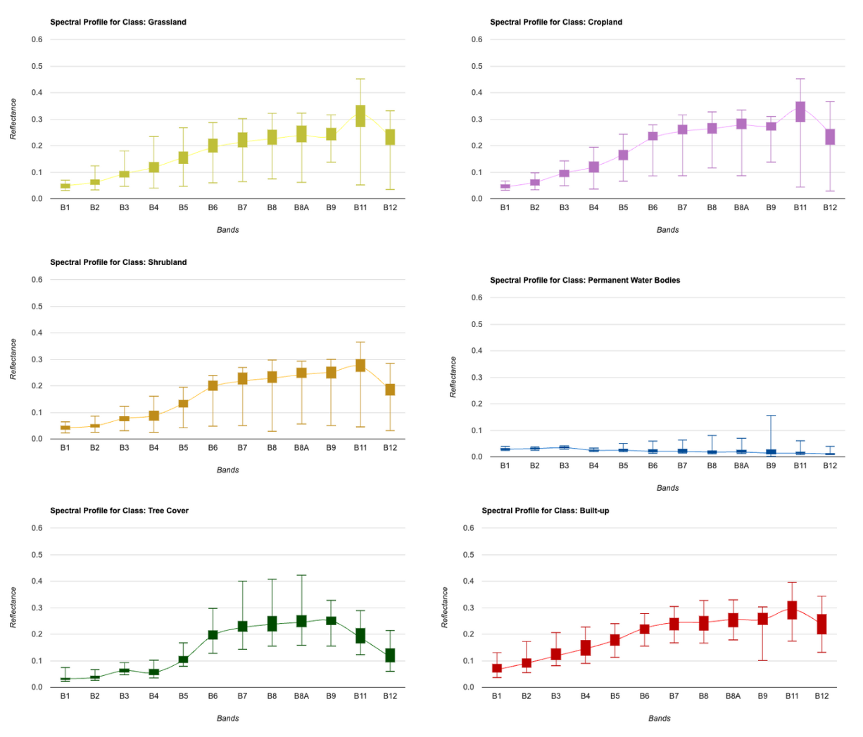
Spectral Profile Charts
// Example script showing how to create spectral profile
// chart for different landcover classes that show
// the spread of values using a box plot.

// Select a region
var geometry =   ee.Geometry.Polygon([[
  [76.816, 13.006],[76.816, 12.901],
  [76.899, 12.901],[76.899, 13.006]
]]);

Map.centerObject(geometry, 12);
Map.addLayer(geometry, {color: 'gray'}, 'Selected Region');

// We use Sentinel-2 Level-2A data
var s2 = ee.ImageCollection('COPERNICUS/S2_SR_HARMONIZED');

// Write a function for Cloud masking
var maskS2clouds = function(image) {
  var qa = image.select('QA60')
  var cloudBitMask = 1 << 10;
  var cirrusBitMask = 1 << 11;
  var mask = qa.bitwiseAnd(cloudBitMask).eq(0).and(
             qa.bitwiseAnd(cirrusBitMask).eq(0))
  return image.updateMask(mask)
      .select('B.*')
      .copyProperties(image, ['system:time_start'])
}

// Write a function to scale the bands
var scaleImage = function(image) {
  return image
    .multiply(0.0001)
    .copyProperties(image, ['system:time_start'])
}

var filtered = s2
  .filter(ee.Filter.lt('CLOUDY_PIXEL_PERCENTAGE', 30))
  .filter(ee.Filter.bounds(geometry))
  .filter(ee.Filter.date('2021-01-01', '2022-01-01'))
  .map(maskS2clouds)
  .map(scaleImage);

// Create a median composite for 2021
var composite =  filtered.median();

var rgbVis = {min: 0.0, max: 0.3, bands: ['B4', 'B3', 'B2']};
Map.addLayer(composite.clip(geometry), rgbVis, '2020 Composite');

// We use the ESA WorldCover 2021 dataset
var worldcover = ee.ImageCollection('ESA/WorldCover/v200').first();

// The image has 11 classes
// Remap the class values to have continuous values
// from 0 to 10
var classified = worldcover.remap(
  [10, 20, 30, 40, 50, 60, 70, 80, 90, 95, 100],
  [0,  1 , 2,  3,  4,  5,  6,  7,  8,  9,  10]).rename('classification');

// Define a list of class names
var worldCoverClassNames= [
  'Tree Cover', 'Shrubland', 'Grassland', 'Cropland', 'Built-up',
  'Bare / sparse Vegetation', 'Snow and Ice',
  'Permanent Water Bodies', 'Herbaceous Wetland',
  'Mangroves', 'Moss and Lichen'];
// Define a list of class colors
var worldCoverPalette = [
  '006400', 'ffbb22', 'ffff4c', 'f096ff', 'fa0000',
  'b4b4b4', 'f0f0f0', '0064c8', '0096a0', '00cf75',
  'fae6a0'];
// We define a dictionary with class names
var classNames = ee.Dictionary.fromLists(
  ['0','1','2','3','4','5','6','7','8','9', '10'],
  worldCoverClassNames
);
// We define a dictionary with class colors
var classColors = ee.Dictionary.fromLists(
  ['0','1','2','3','4','5','6','7','8','9', '10'],
  worldCoverPalette
);
var worldCoverVisParams = {min:0, max:10, palette: worldCoverPalette};
Map.addLayer(classified.clip(geometry), worldCoverVisParams, 'Landcover');

// We sample spectral values from S2 image for each class
var samples = composite.addBands(classified)
  .stratifiedSample({
    numPoints: 50,
    classBand: 'classification',
    region: geometry,
    scale: 10,
    tileScale: 16,
    geometries: true
});

print('Stratified Samples', samples);
Map.addLayer(samples, {color: 'red'}, 'Samples');

// To create a box plot, we need minimum, maximum,
// median and 25- and 75-percentile values for
// each band for each class
var bands = composite.bandNames();
var properties = bands.add('classification');

// Now we have multiple columns, so we have to repeat the reducer
var numBands = bands.length();

// We need the index of the group band
var groupIndex = properties.indexOf('classification');

// Create a combined reducer for all required statistics
var allReducers = ee.Reducer.median()
  .combine({reducer2: ee.Reducer.min(), sharedInputs: true} )
  .combine({reducer2: ee.Reducer.max(), sharedInputs: true} )
  .combine({reducer2: ee.Reducer.percentile([25]), sharedInputs: true} )
  .combine({reducer2: ee.Reducer.percentile([75]), sharedInputs: true} )

// Repeat the combined reducer for each band and
// group results by class
var stats = samples.reduceColumns({
    selectors: properties,
    reducer: allReducers.repeat(numBands).group({
      groupField: groupIndex}),
});
var groupStats = ee.List(stats.get('groups'));
print(groupStats);

// We do some post-processing to format the results

var spectralStats = ee.FeatureCollection(groupStats.map(function(item) {
  var itemDict = ee.Dictionary(item);
  var classNumber = itemDict.get('group');
  // Extract the stats
  // Create a featute for each statistics for each class
  var stats = ee.List(['median', 'min', 'max', 'p25', 'p75']);
  // Create a key such as B1_min, B1_max, etc.
  var keys = stats.map(function(stat) {
    var bandKeys = bands.map(function(bandName) {
      return ee.String(stat).cat('_').cat(bandName);
      })
    return bandKeys;
    }).flatten();
  // Extract the values
  var values = stats.map(function(stat) {
    return itemDict.get(stat);
  }).flatten();
  var properties = ee.Dictionary.fromLists(keys, values);
  var withClass = properties
    .set('class', classNames.get(classNumber))
    .set('class_number', classNumber);
  return ee.Feature(null, withClass);
}));
print('Average Spectral Values for Each Class', spectralStats);

// Now we need to create a spectral signature chart
// for each class.

// Write a function to create a chart for each class
var createChart = function(className) {
  var classFeature = spectralStats.filter(ee.Filter.eq('class', className)).first();
  var classNumber = classFeature.get('class_number');
  var classColor = classColors.get(classNumber);
  // X-Axis has Band Names, so we create a row per band
  var rowList = bands.map(function(band) {
    var stats = ee.List(['median', 'min', 'max', 'p25', 'p75']);
    var values = stats.map(function(stat) {
      var key = ee.String(stat).cat('_').cat(band);
      var value = classFeature.get(key);
      return {v: value}
    });
    // Row name is the first value
    var rowValues = ee.List([{v: band}]);
    // Append other values
    rowValues = rowValues.cat(values);

    var rowDict = {
      c: rowValues
    };
  return rowDict;
  });
  // We need to convert the server-side rowList and
  // classColor objects to client-side javascript object
  // use evaluate()
  rowList.evaluate(function(rowListClient) {
    classColor.evaluate(function(classColor) {
       var dataTable = {
        cols: [
          {id: 'x', type: 'string', role: 'domain'},
          {id: 'median', type: 'number', role: 'data'},
          {id: 'min', type: 'number', role: 'interval'},
          {id: 'max', type: 'number', role: 'interval'},
          {id: 'firstQuartile', type: 'number', role: 'interval'},
          {id: 'thirdQuartile', type:'number', role: 'interval'},
        ],
        rows: rowListClient
      };

      var options = {
        title:'Spectral Profile for Class: ' + className,
        vAxis: {
          title: 'Reflectance',
          gridlines: {
            color: '#d9d9d9'
          },
          minorGridlines: {
            color: 'transparent'
          },
          viewWindow: {
            min:0,
            max:0.6
          }
        },
        hAxis: {
          title: 'Bands',
          gridlines: {
            color: '#d9d9d9'
          },
          minorGridlines: {
            color: 'transparent'
          }
        },
        legend: {position: 'none'},
        lineWidth: 1,
        interpolateNulls: true,
        curveType: 'function',
        series: [{'color': classColor}],
        intervals: {
          barWidth: 0.5,
          boxWidth: 0.5,
          lineWidth: 1,
          style: 'boxes',
          fillOpacity: 1,

        },
        interval: {
          min: {
            style: 'bars',
          },
          max: {
            style: 'bars',
          }
      },
        chartArea: {left:100, right:100}
      };

      var chart = ui.Chart(dataTable, 'LineChart', options);
      print(chart);
      });

    })


};

// We get a list of classes
var classNames = spectralStats.aggregate_array('class');
// Call the function for each class name to create the chart
print('Creating charts. Please wait...');
classNames.evaluate(function(classNames) {
  for (var i = 0; i < classNames.length; i++) {
    createChart(classNames[i]);
  }
});
References
- Google Earth Engine Developer Guide: Chart Documentation
Data Credits
- Abatzoglou, J.T., S.Z. Dobrowski, S.A. Parks, K.C. Hegewisch, 2018, Terraclimate, a high-resolution global dataset of monthly climate and climatic water balance from 1958-2015, Scientific Data 5:170191, doi:10.1038/sdata.2017.191
- Funk, Chris, Pete Peterson, Martin Landsfeld, Diego Pedreros, James Verdin, Shraddhanand Shukla, Gregory Husak, James Rowland, Laura Harrison, Andrew Hoell & Joel Michaelsen. “The climate hazards infrared precipitation with stations-a new environmental record for monitoring extremes”. Scientific Data 2, 150066. doi:10.1038/sdata.2015.66 2015.
- GFS: Global Forecast System 384-Hour Predicted Atmosphere Data. Source
- MOD13Q1.006 Terra Vegetation Indices 16-Day Global 250m: Didan, K. (2015). MOD13Q1 MODIS/Terra Vegetation Indices 16-Day L3 Global 250m SIN Grid V006 [Data set]. NASA EOSDIS Land Processes DAAC. Accessed 2023-05-06 from https://doi.org/10.5067/MODIS/MOD13Q1.006
- Li, Xuecao; Zhou, Yuyu; zhao, Min; Zhao, Xia (2020): Harmonization of DMSP and VIIRS nighttime light data from 1992-2020 at the global scale. figshare. Dataset. https://doi.org/10.6084/m9.figshare.9828827.v5
- Runfola D, Anderson A, Baier H, Crittenden M, Dowker E, Fuhrig S, et al. (2020) geoBoundaries: A global database of political administrative boundaries. PLoS ONE 15(4): e0231866. https://doi.org/10.1371/journal.pone.0231866
- Sentinel-2 Level-2A: Contains Copernicus Sentinel data.
- Zanaga, D., Van De Kerchove, R., Daems, D., De Keersmaecker, W., Brockmann, C., Kirches, G., Wevers, J., Cartus, O., Santoro, M., Fritz, S., Lesiv, M., Herold, M., Tsendbazar, N.E., Xu, P., Ramoino, F., Arino, O., 2022. ESA WorldCover 10 m 2021 v200. (doi:10.5281/zenodo.7254221)
- Global Energy Observatory, Google, KTH Royal Institute of Technology in Stockholm, Enipedia, World Resources Institute. 2019. Global Power Plant Database. Published on Resource Watch and Google Earth Engine. http://resourcewatch.org/ https://earthengine.google.com/
- Wagemann, Julia, Siemen, Stephan, Seeger, Bernhard, & Bendix, Jörg. (2020). User requirements of Big Earth Data - Survey 2019 (0.1) [Data set]. Zenodo. https://doi.org/10.5281/zenodo.4075058
- Elvidge, C.D, Zhizhin, M., Ghosh T., Hsu FC, Taneja J. Annual time series of global VIIRS nighttime lights derived from monthly averages:2012 to 2019. Remote Sensing 2021, 13(5), p.922, https://doi.org/10.3390/rs13050922
- Sims, K., Reith, A., Bright, E., McKee, J., & Rose, A. (2022). LandScan Global 2021 [Data set]. Oak Ridge National Laboratory. https://doi.org/10. 48690/1527702
- Hansen, M. C., P. V. Potapov, R. Moore, M. Hancher, S. A. Turubanova, A. Tyukavina, D. Thau, S. V. Stehman, S. J. Goetz, T. R. Loveland, A. Kommareddy, A. Egorov, L. Chini, C. O. Justice, and J. R. G. Townshend. 2013. “High-Resolution Global Maps of 21st-Century Forest Cover Change.” Science 342 (15 November): 850-53. 10.1126/science.1244693 Data available on-line at: https://glad.earthengine.app/view/global-forest-change.
- Elvidge, C.D, Zhizhin, M., Ghosh T., Hsu FC, Taneja J. Annual time series of global VIIRS nighttime lights derived from monthly averages:2012 to 2019. Remote Sensing 2021, 13(5), p.922, doi:10.3390/rs13050922 doi:10.3390/rs13050922
License
The course material (text, images, presentation, videos) is licensed under a Creative Commons Attribution 4.0 International License.
The code (scripts, Jupyter notebooks) is licensed under the MIT License. For a copy, see https://opensource.org/licenses/MIT
You are free to re-use and adapt the material but are required to give appropriate credit to the original author as below:
Copyright © 2023 Ujaval Gandhi www.spatialthoughts.com
Citing and Referencing
You can cite the course materials as follows
- Gandhi, Ujaval, 2023. Creating Publication Quality Charts with GEE Course. Spatial Thoughts. https://courses.spatialthoughts.com/gee-charts.html
If you want to report any issues with this page, please comment below.